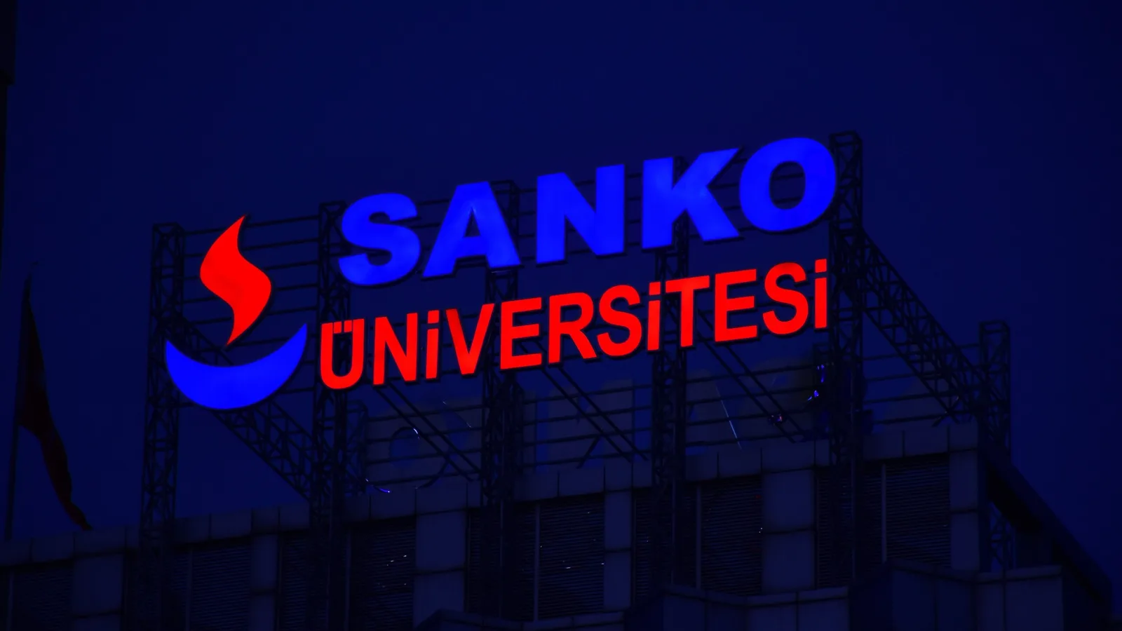
Expressing the corporate identity accurately, at the scale of the building.
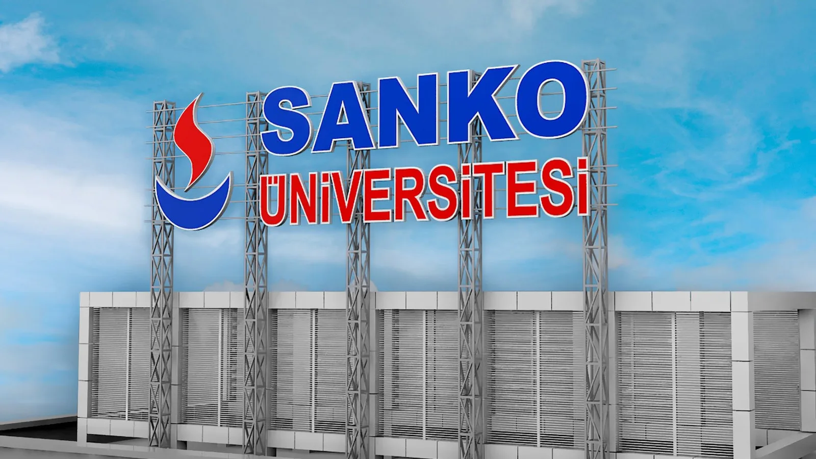
We aimed for the university’s name to be perceived clearly and in balance, in harmony with the architecture. We evaluated lettering scale, viewing angles and the application surface together.
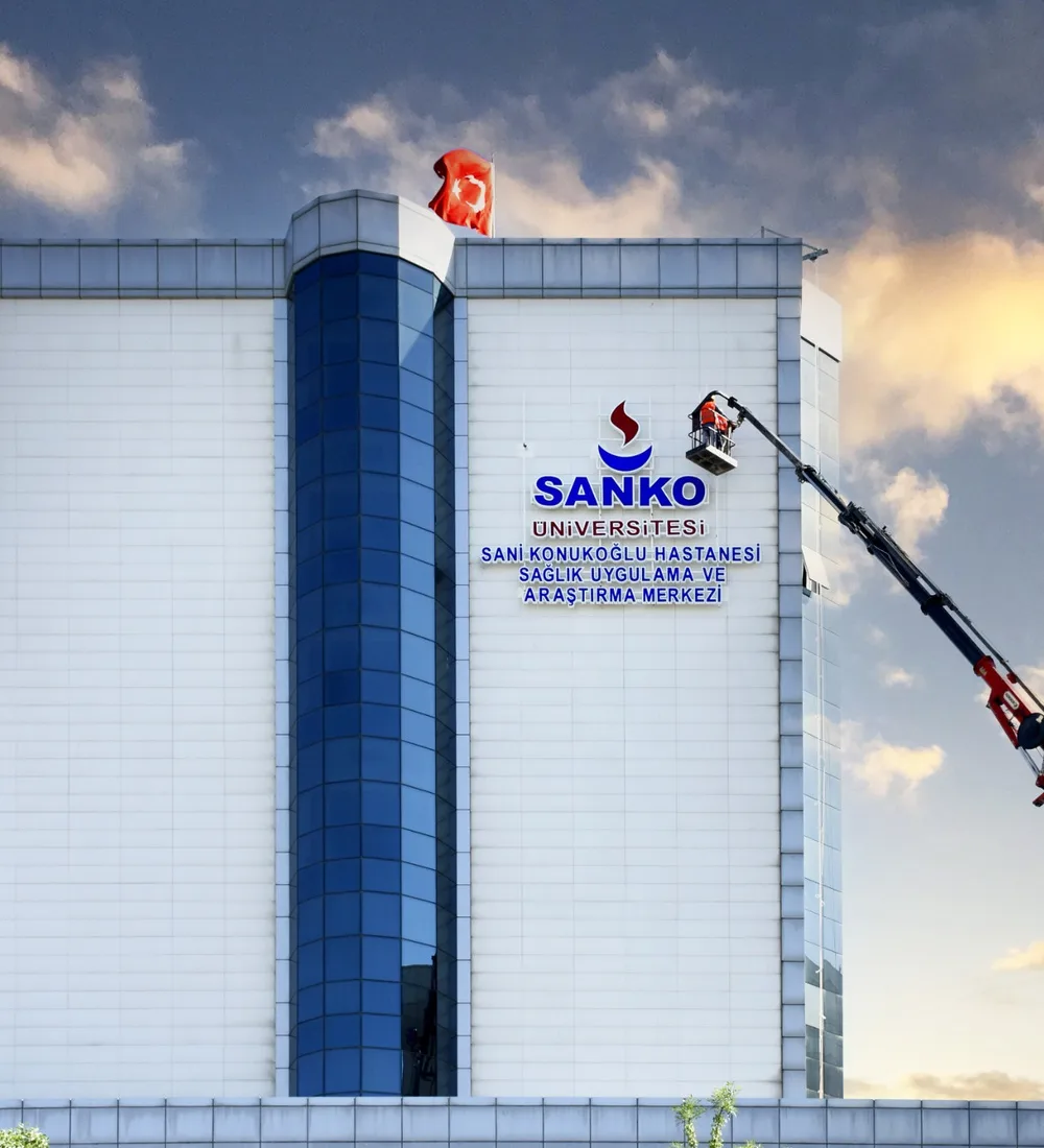
We built visibility through the right proportions and placement.
Taking the institution’s existing identity as our foundation, we addressed the position and balance of the letters on the facade. We developed an application approach that complements the architecture and prioritizes legibility.
Outdoor
Facade lettering and signage applications that carry the university’s corporate identity onto the building, with carefully considered letter scale and placement.
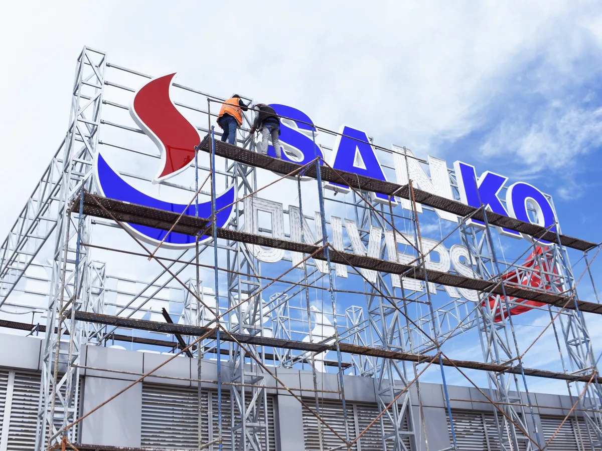
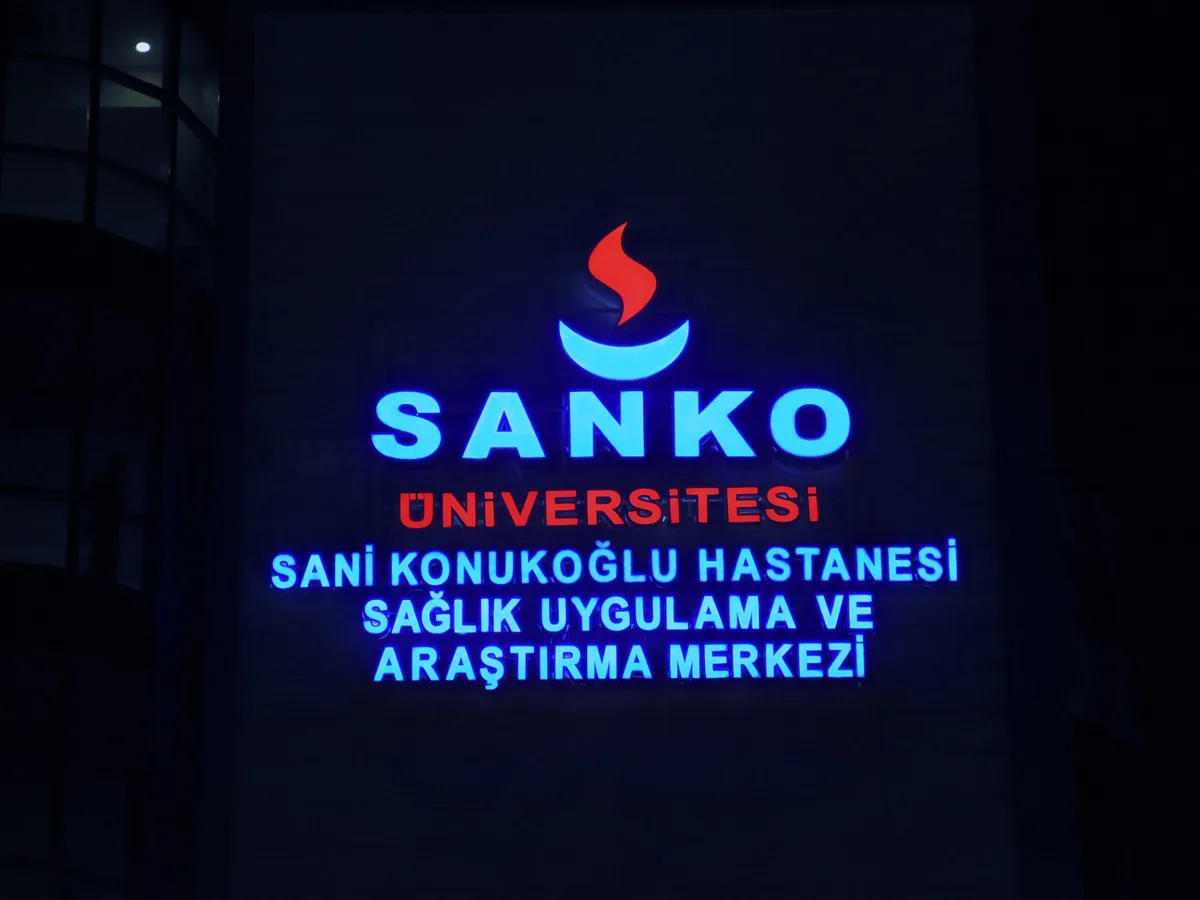
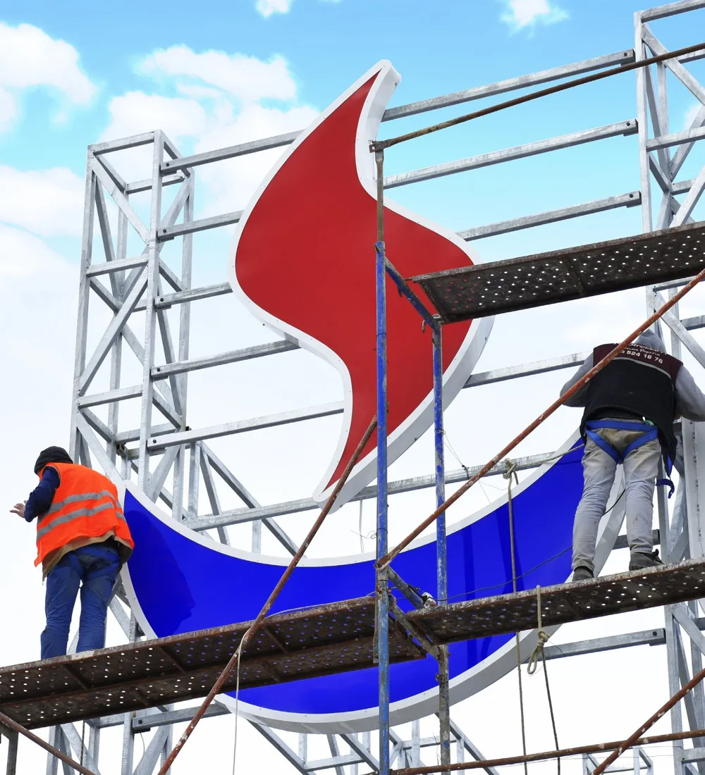
We ensured the integrity of the application through precision in every detail.
We considered letter dimensions, spacing and mounting alignment together. We completed the production and installation process in a way that preserves the corporate look and its harmony with the facade.
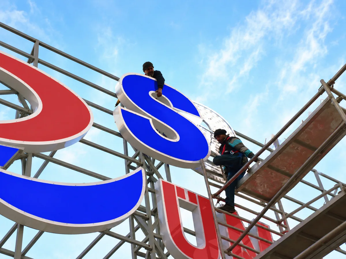
A signature worthy of the institution’s identity, completing its architecture.
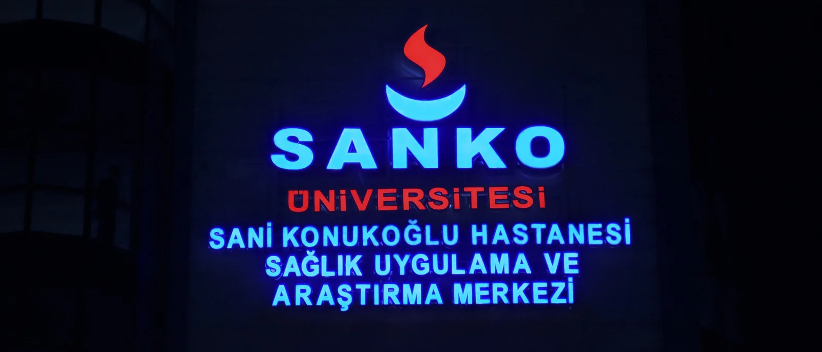
“It was a project true to our institution’s identity, with every application detail handled with care. The resulting look met our expectations.”
SANKO University — Corporate Communications Team