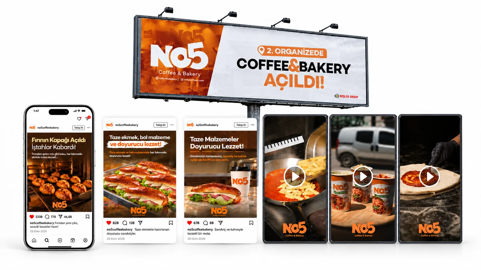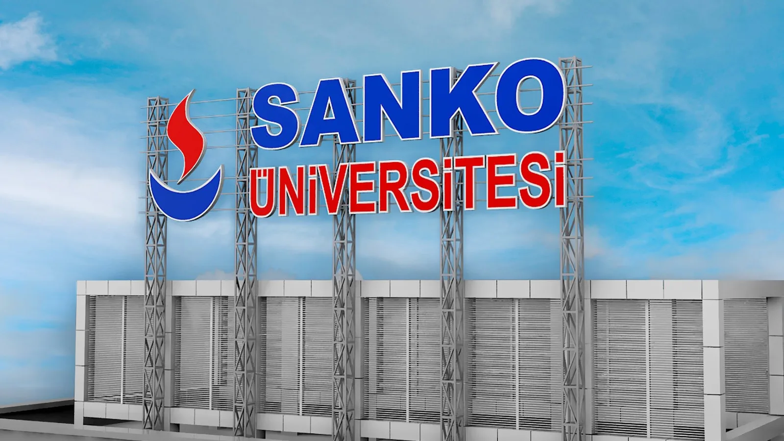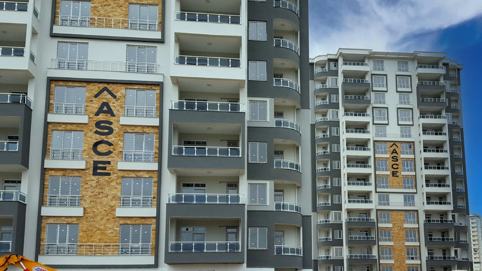
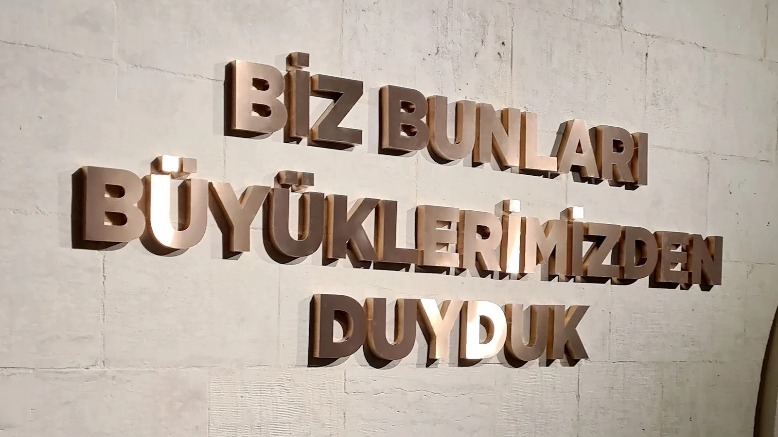
Creating a coherent whole that defines the space and guides visitors.
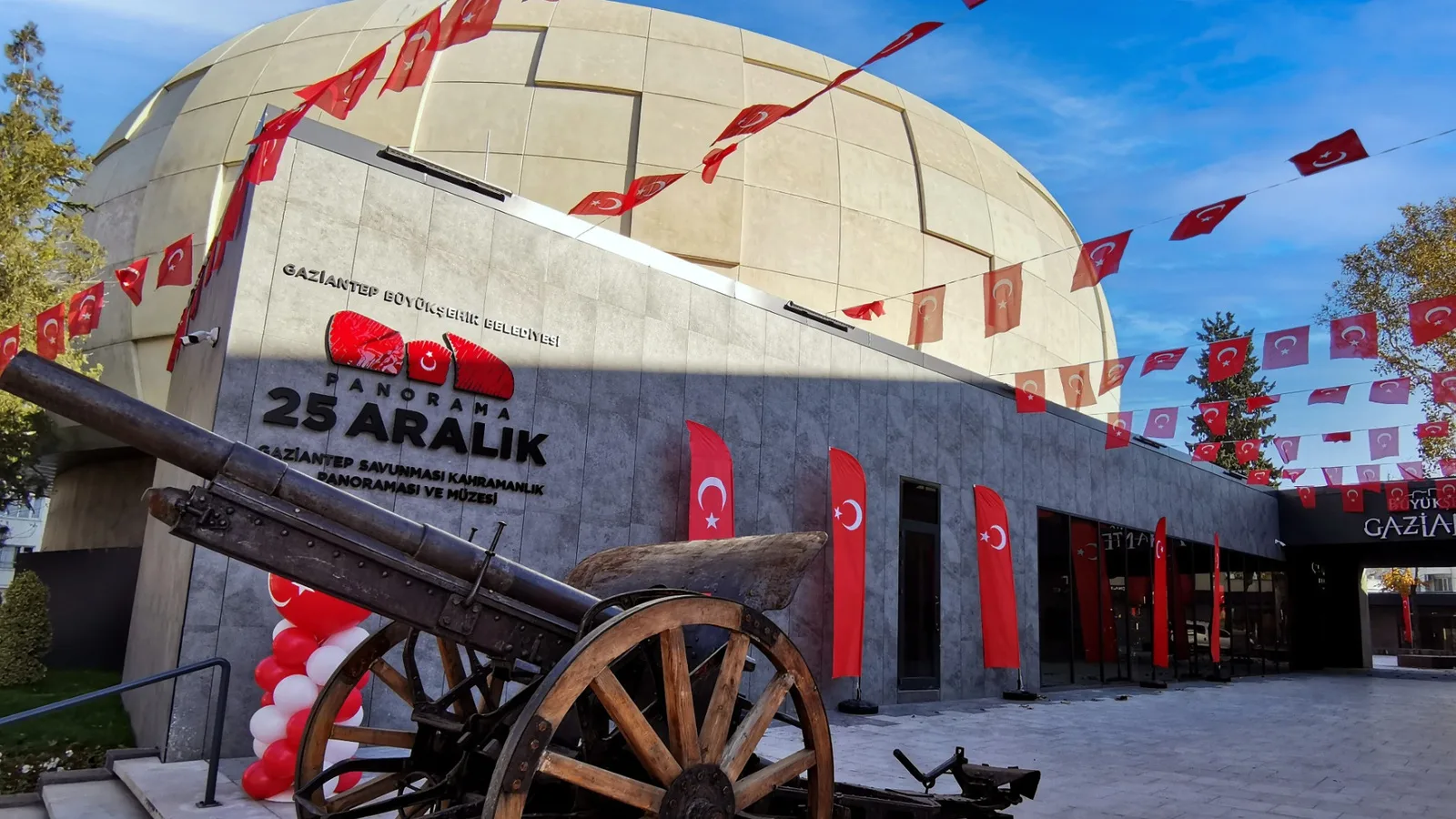
We aimed for legible applications in harmony with the architecture that make the museum’s different areas easy to identify. We considered institutional visibility and visitor wayfinding together.
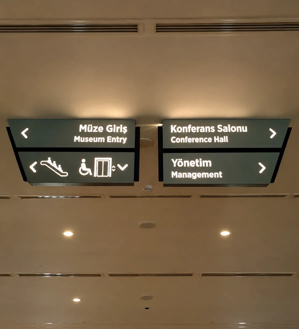
We considered every piece of lettering together with the function of its space.
We shaped lettering scales, placements and wayfinding elements according to how each area is used. We created a consistent application language that extends from the façade to the interior.
Outdoor
Applications that make the museum’s identity and the function of its spaces visible through façade lettering, channel letters and illuminated wayfinding.
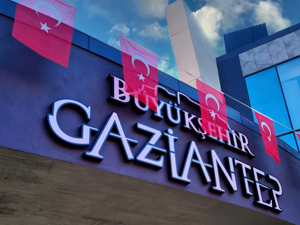
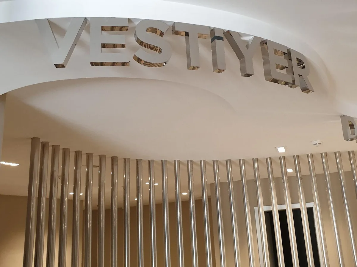
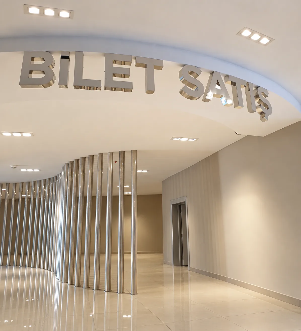
We completed the design with material and installation details.
We evaluated the scale of the letters, their relationship with the surface and the placement of the signage together. We produced applications that preserve legibility and visual harmony across different areas.
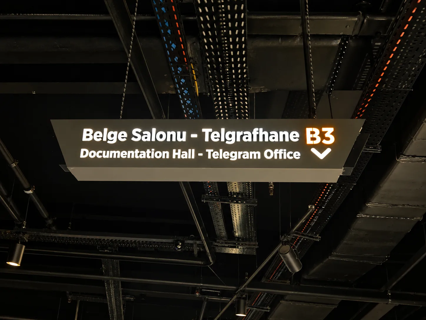
Applications that sharpen the identity and guide visitors.
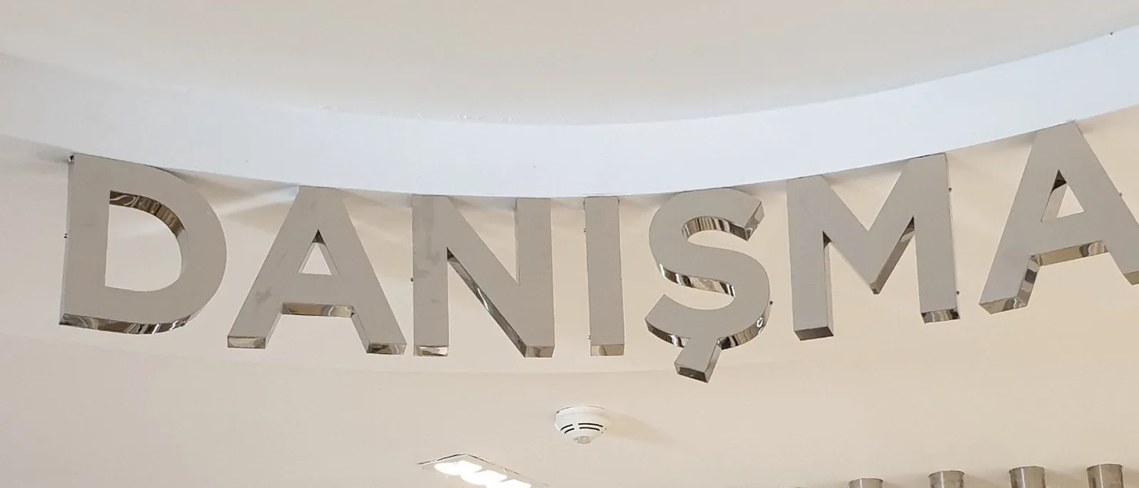
“The way the applications harmonise with our museum’s architecture and the clarity of the wayfinding met our expectations. It was a project in which every detail was handled with care.”
25 Aralık Panorama Museum — Corporate Communications Team