Maintaining the same corporate impact at every scale.
We set out to represent the brand clearly and consistently across its project sites. By evaluating viewing distance, application surfaces and architectural proportions together, we designed for strong visibility.
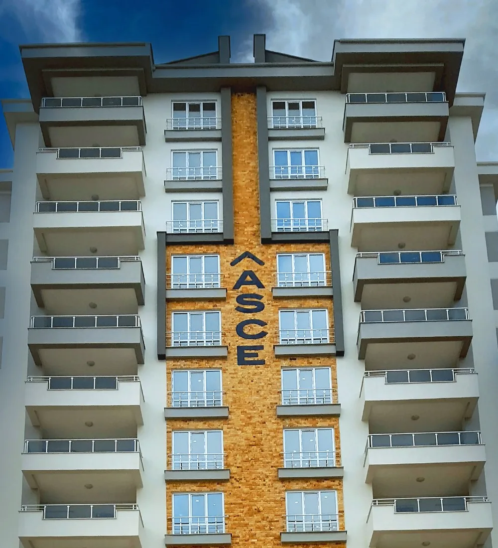
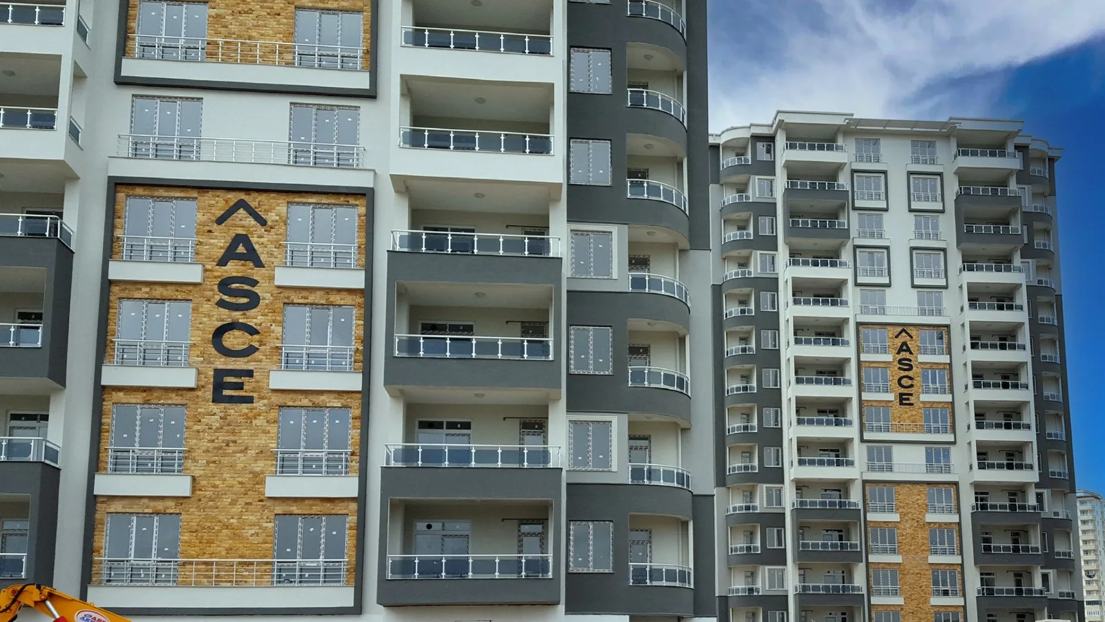
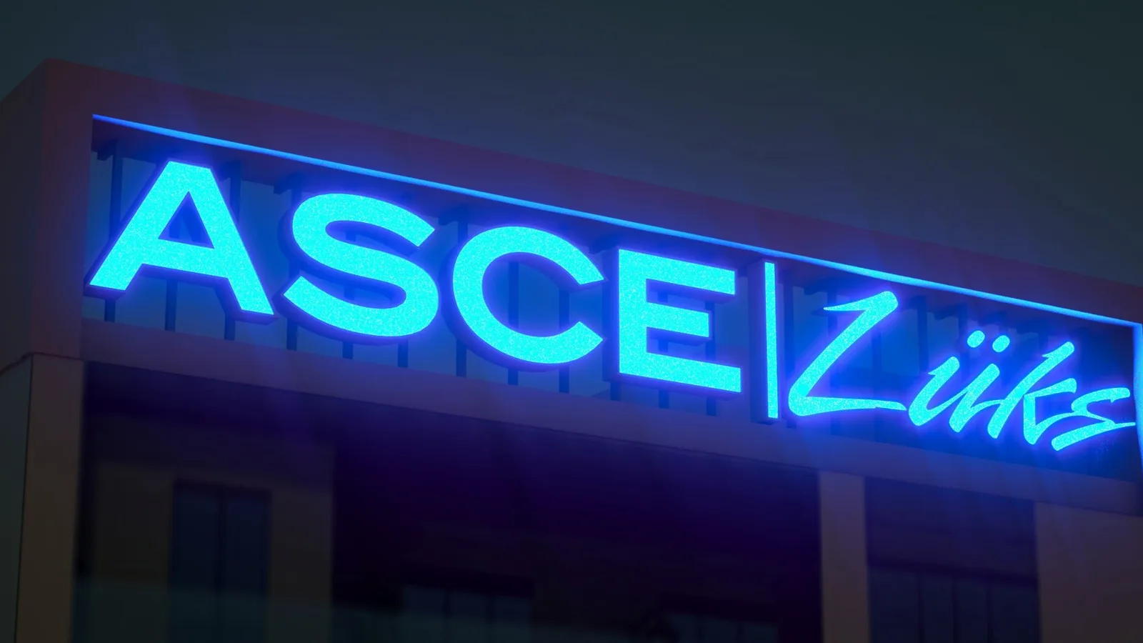
We interpreted the brand’s signature to suit the scale of each building.
We decided lettering sizes and placements hand in hand with the architecture. We developed an approach that preserves legibility across different application areas and carries the brand’s corporate character forward.
Outdoor
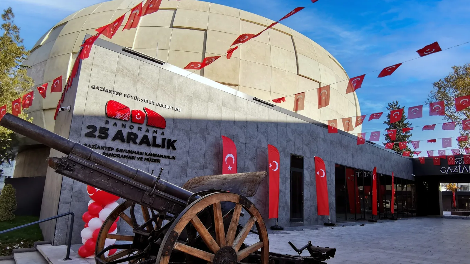
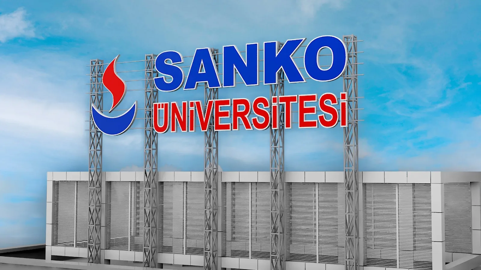
Façade lettering and signage applications that bring brand and project names together with the architecture, with careful attention to scale and legibility.
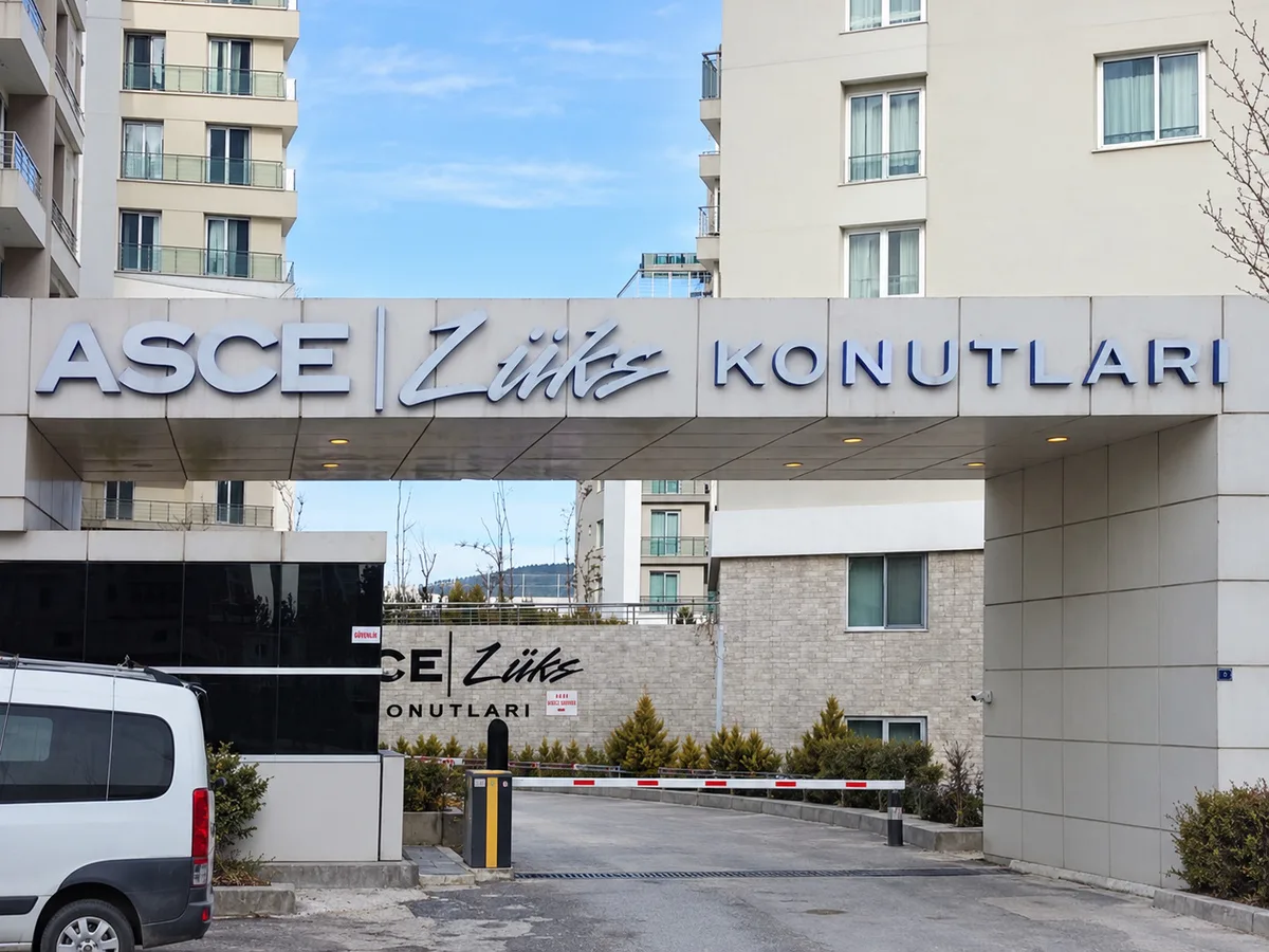
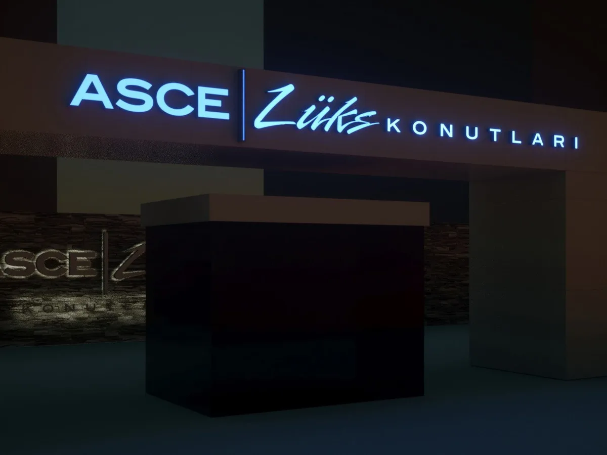
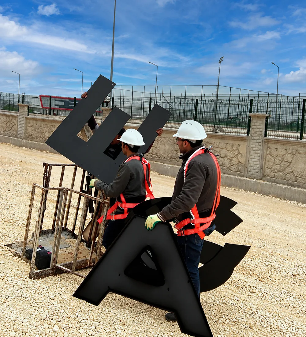
We carried visual consistency through every stage of installation.
We handled dimensions, materials and placement details according to on-site conditions. Watching the proportion and alignment of the letters throughout the process from fabrication to installation, we completed the design’s presence in the space.
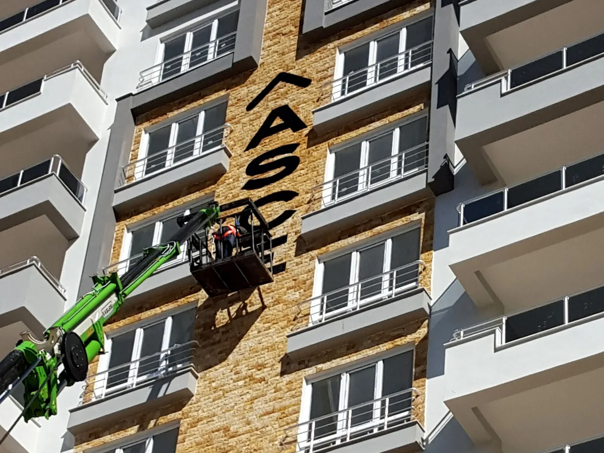
At the scale of the building, in the character of the brand.
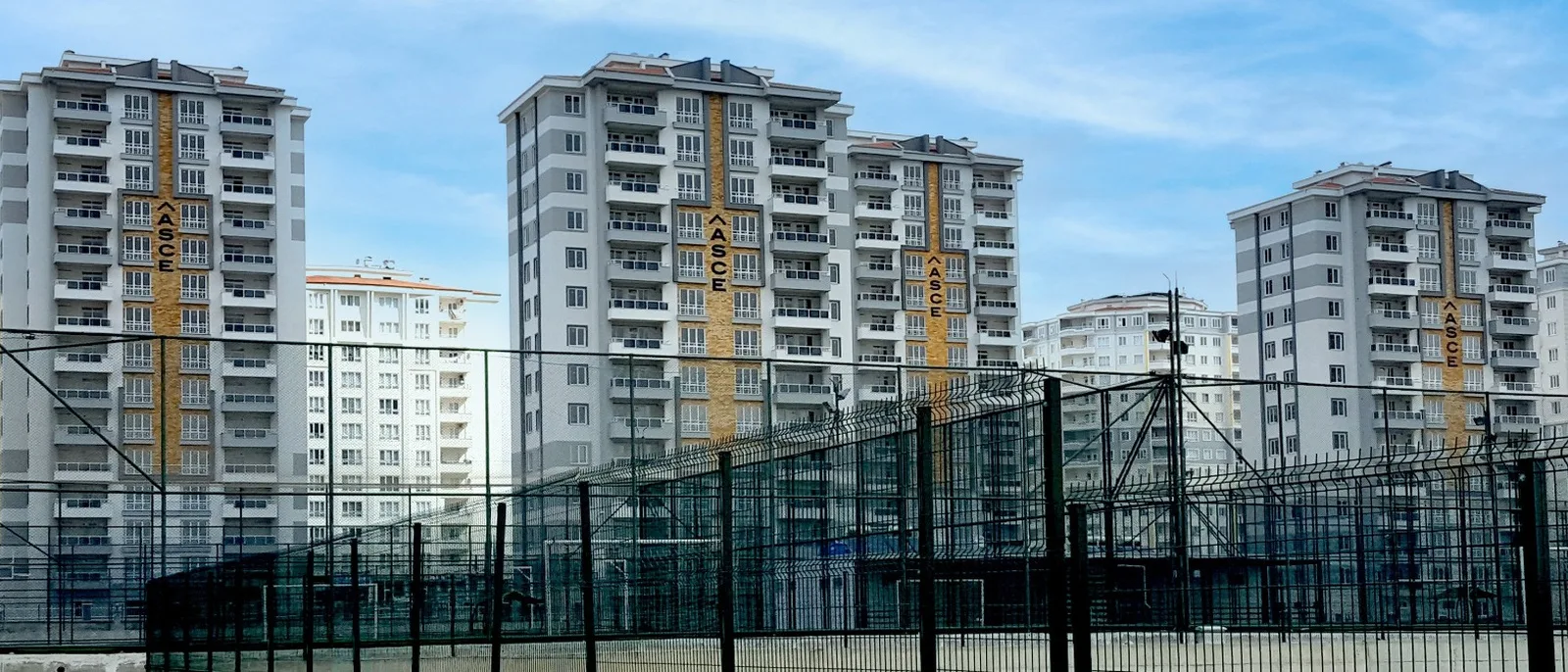
“It was a project that handled our brand’s visibility across our developments the right way, with carefully considered installation details. The final look matched our corporate expectations.”
ASCE — Marketing Team