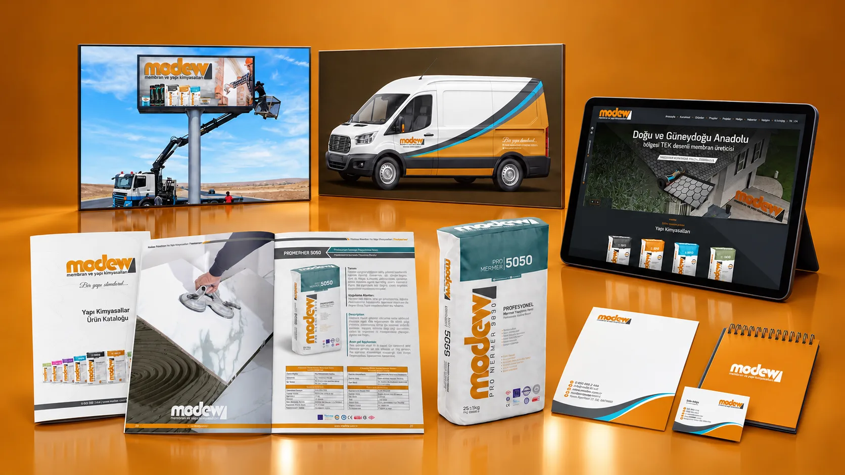
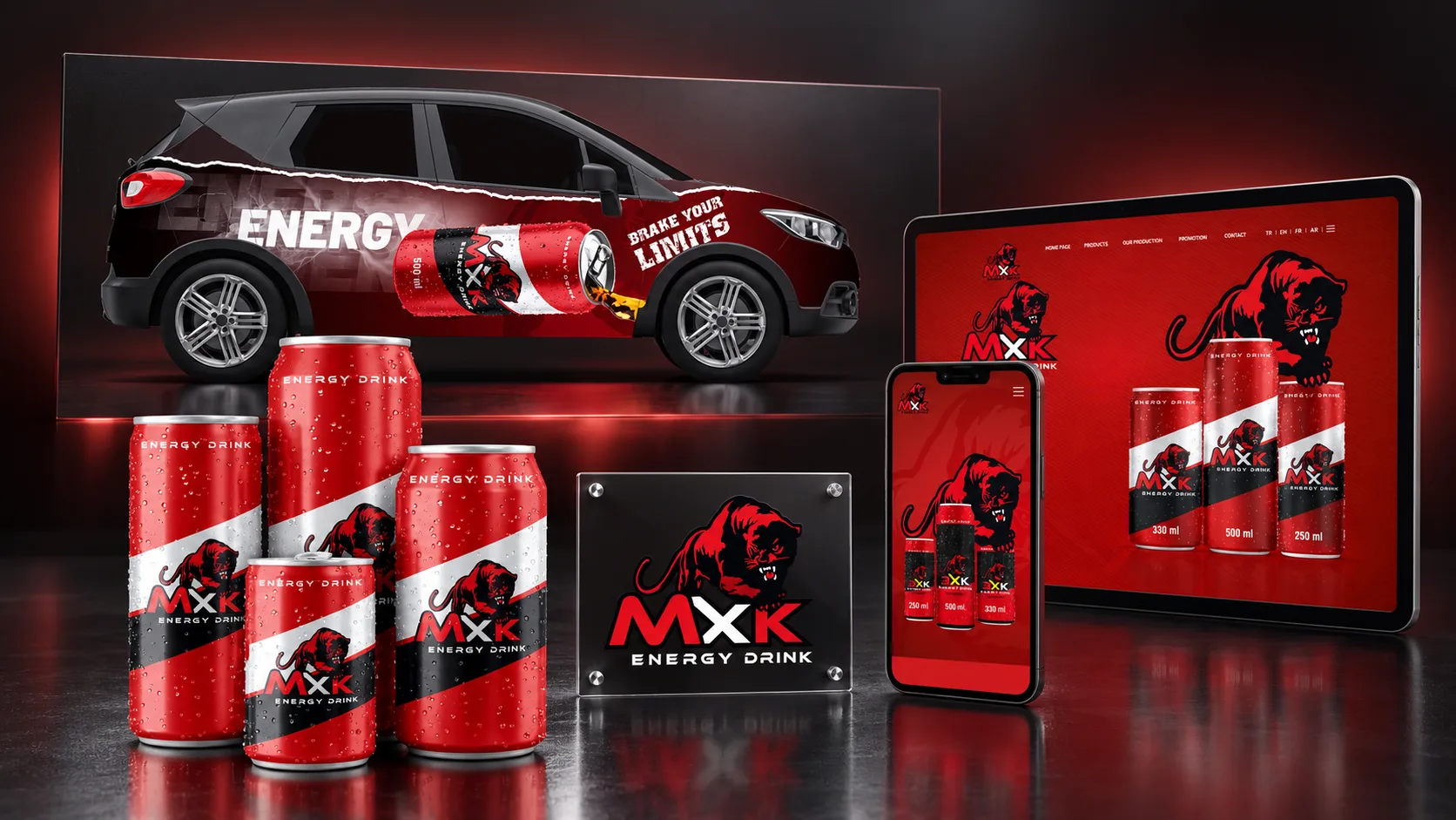
Building a character of its own in a highly competitive market.
At the heart of the project was developing a distinctive, memorable expression for the brand in an energetic category. We aimed for a visual approach that grabs attention on the packaging, is grasped instantly outdoors and carries the same impact in digital spaces. We built every design decision on this cohesion.
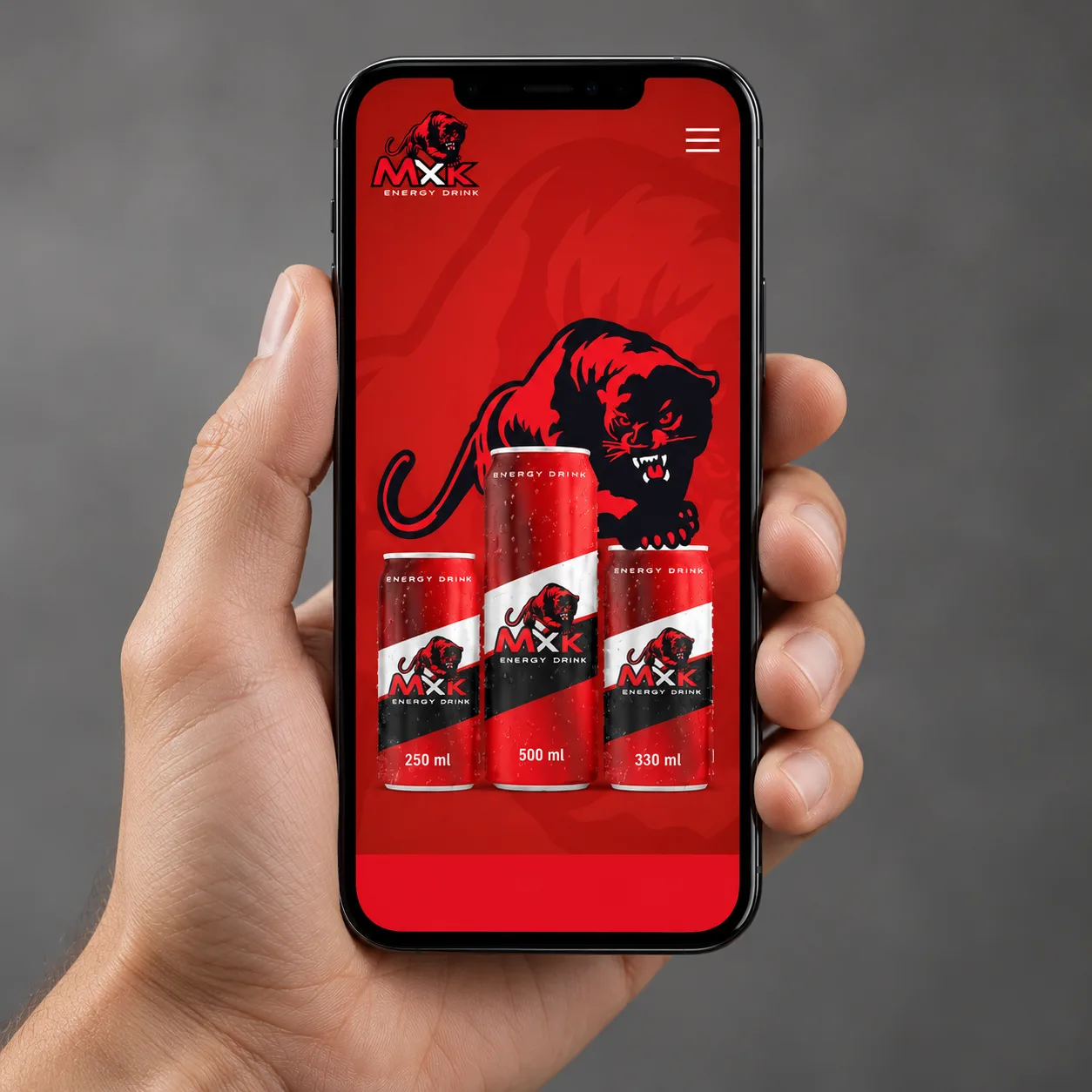
We turned energy into a visual expression unique to the brand.
We defined the brand’s character through strong contrasts, distinctive typography and focused compositions. By considering the close-up impact of the packaging, the need for outdoor work to be read at a glance and the flow of the web experience together, we developed a design language that stays recognisable at every scale.
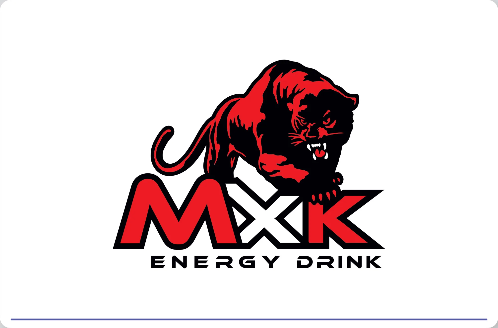
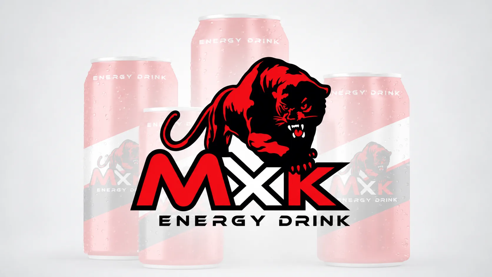
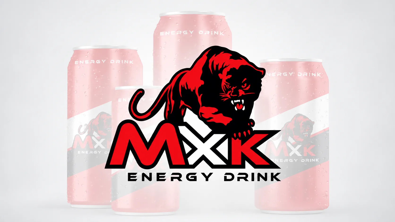
Logo
A logo that reflects the brand’s dynamic character through a distinctive typographic expression and stays recognisable at any size.
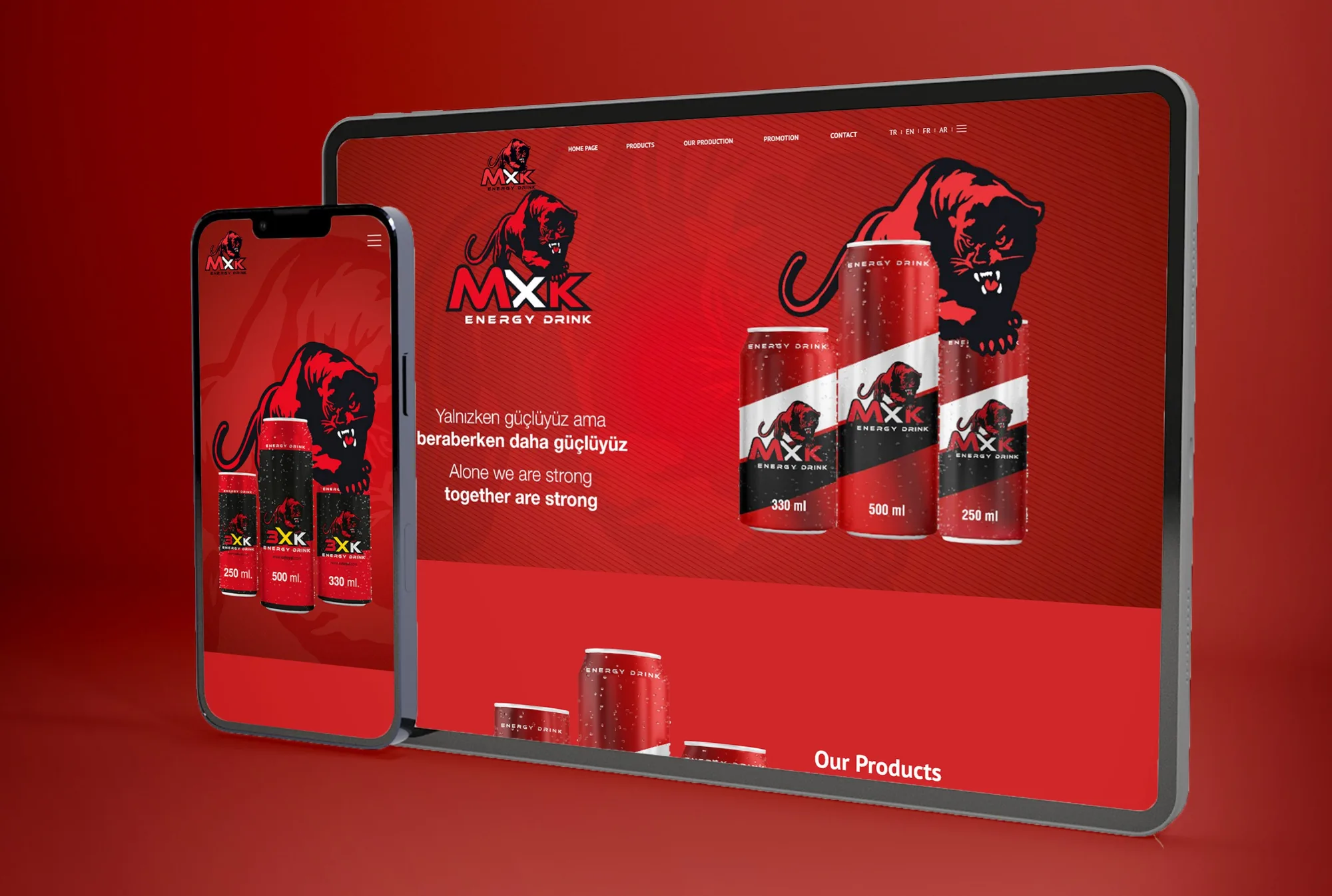
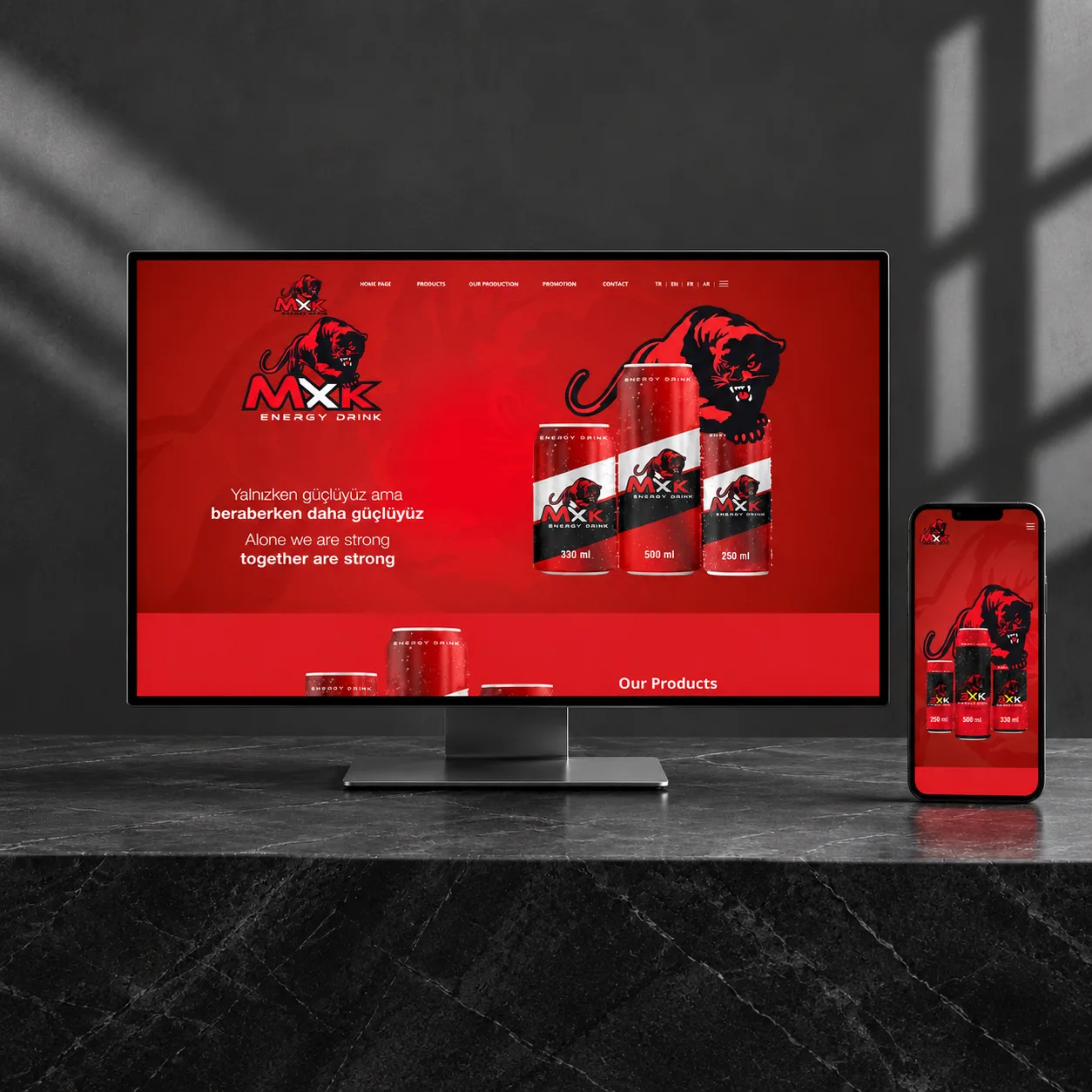
Website
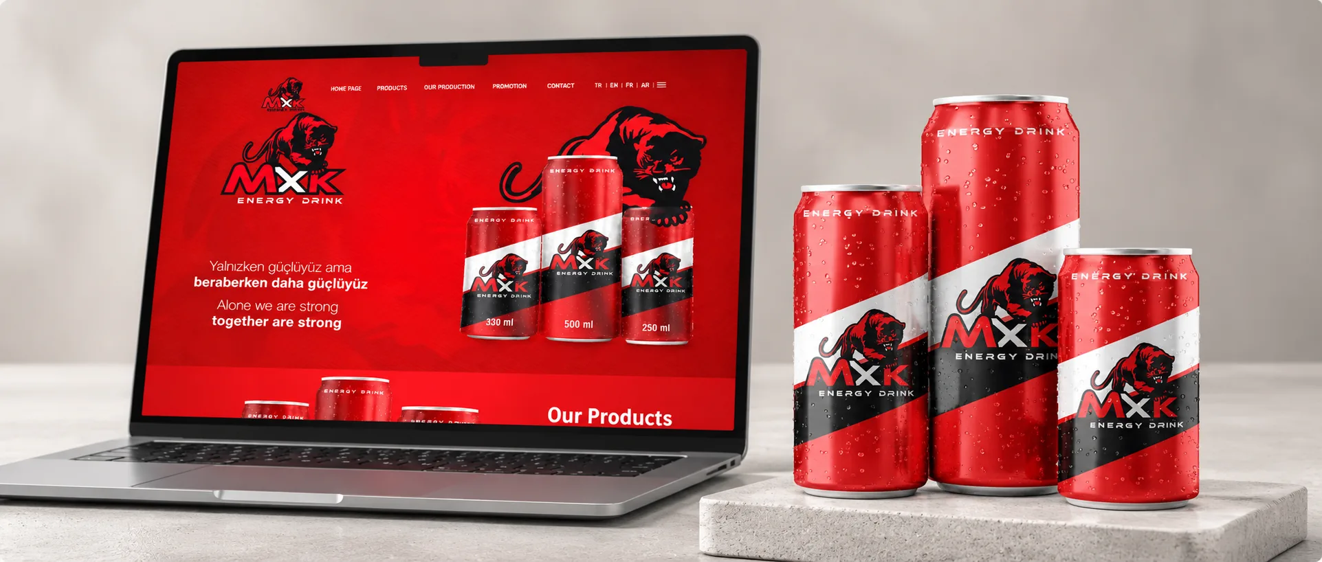
A website that puts the products in the spotlight and presents the brand’s energetic world through clear navigation and an engaging visual flow.
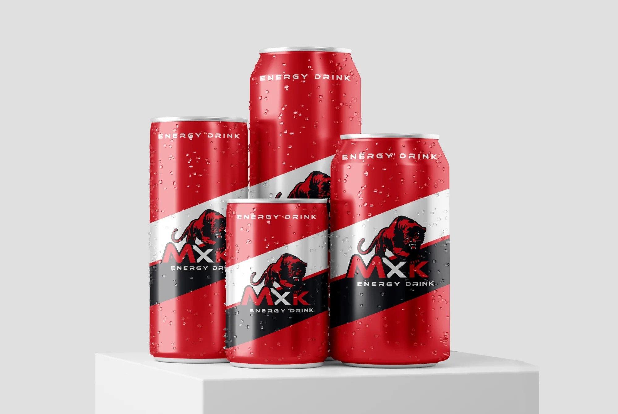
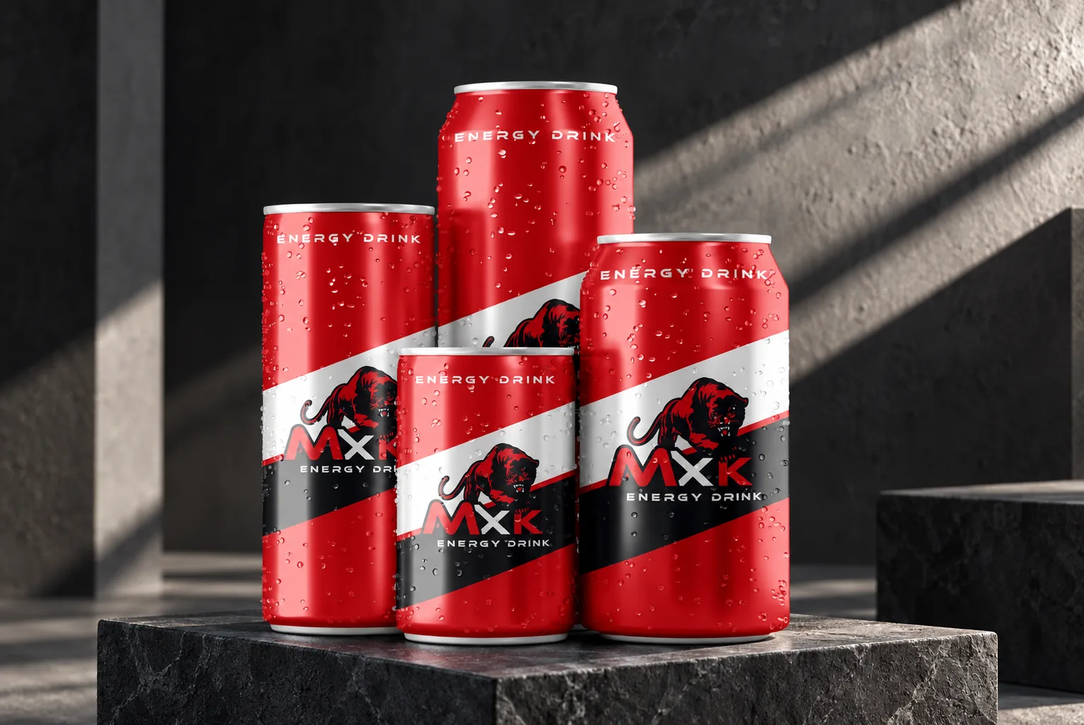
Packaging
Designs that put the brand name boldly up front, organise product information and ensure visual continuity across different pack sizes.
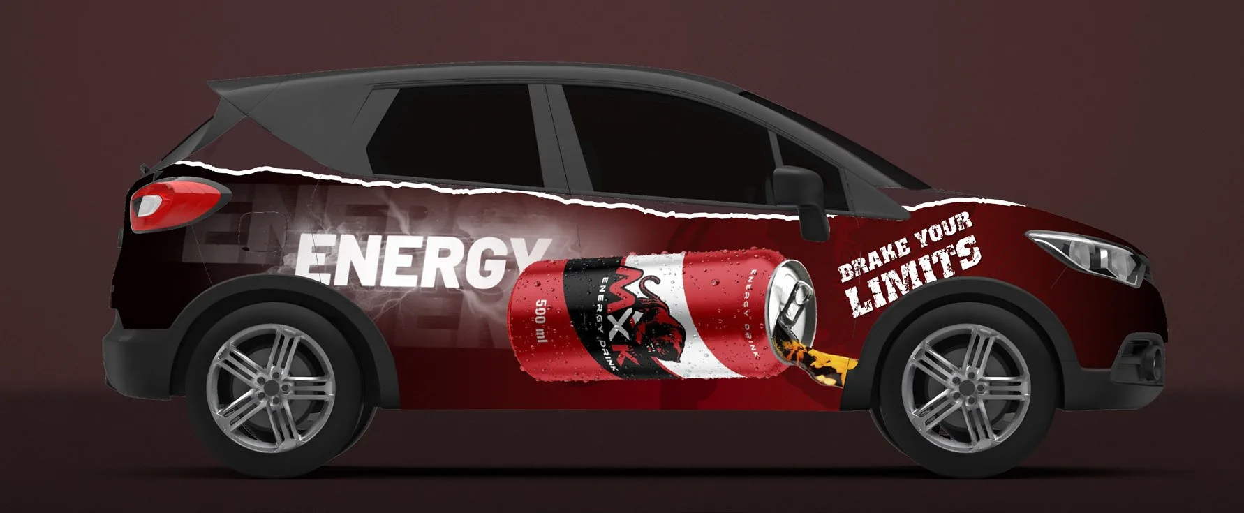
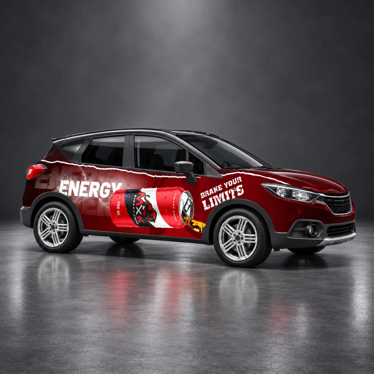
Outdoor
Outdoor designs that combine a concise message, product focus and brand visibility, built to be read from a distance.
We reimagined the visual impact at every scale.
On the packaging, we prioritised the visibility of the brand name and the organisation of information; outdoors, we focused on getting the message across instantly. On the website, we developed the product presentation and page flow with the same visual approach. By treating each application at its own scale, we preserved the brand’s energetic character.
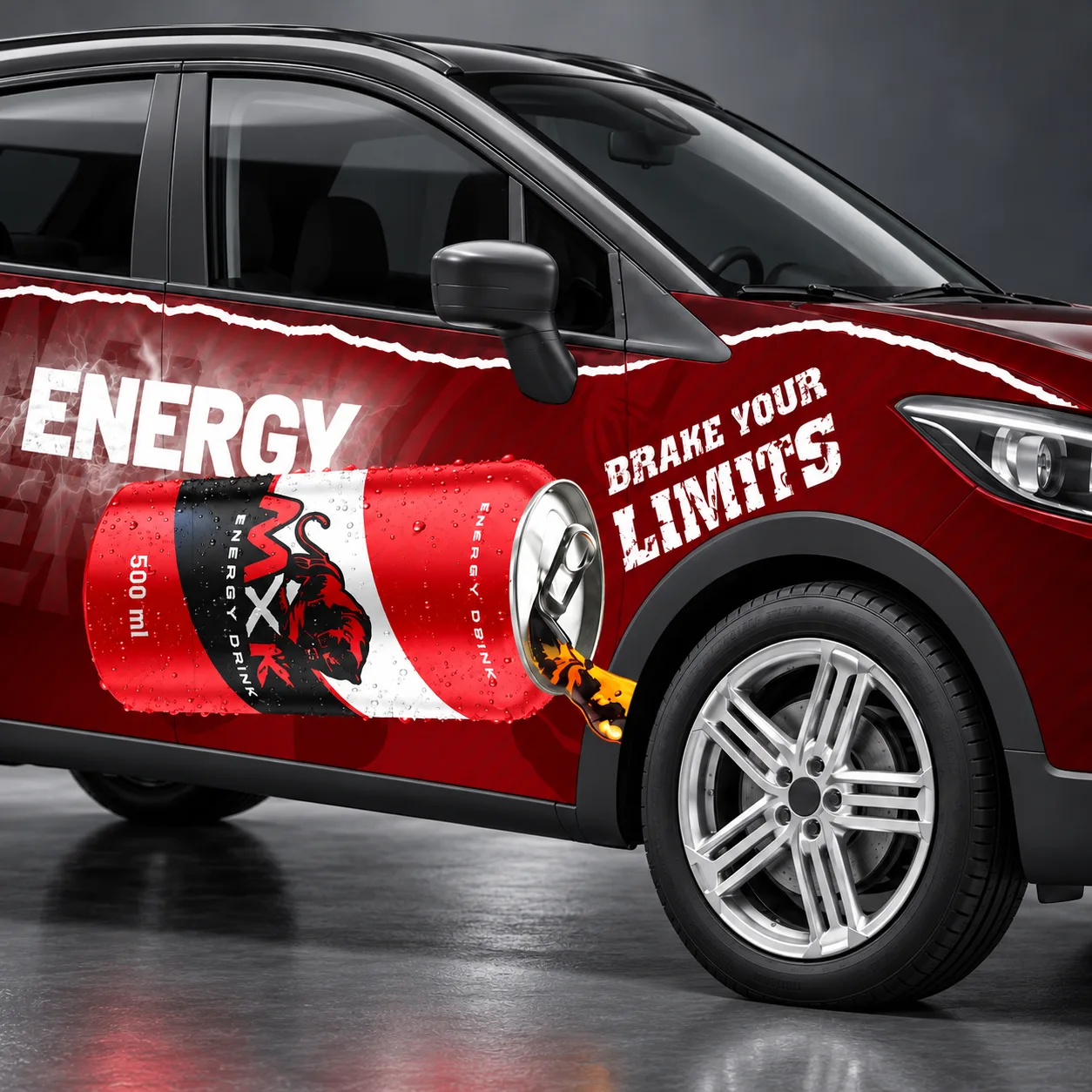
A distinctive brand that draws its energy from design.
“The result was a bold, eye-catching piece of work that truly reflects our brand’s energy. The design approach, extending from packaging to digital presentation, expressed the character we were looking for in a cohesive way.”
MXK — Marketing Team