Simplifying technical information while conveying the brand’s strength.
The project’s core need was to present a range of solution areas clearly while bringing the brand’s trustworthy stance to the fore. We aimed for a structure in which technical content is easy to follow, product groups are clearly distinguished and brand perception is sustained with the same consistency across every channel of communication.
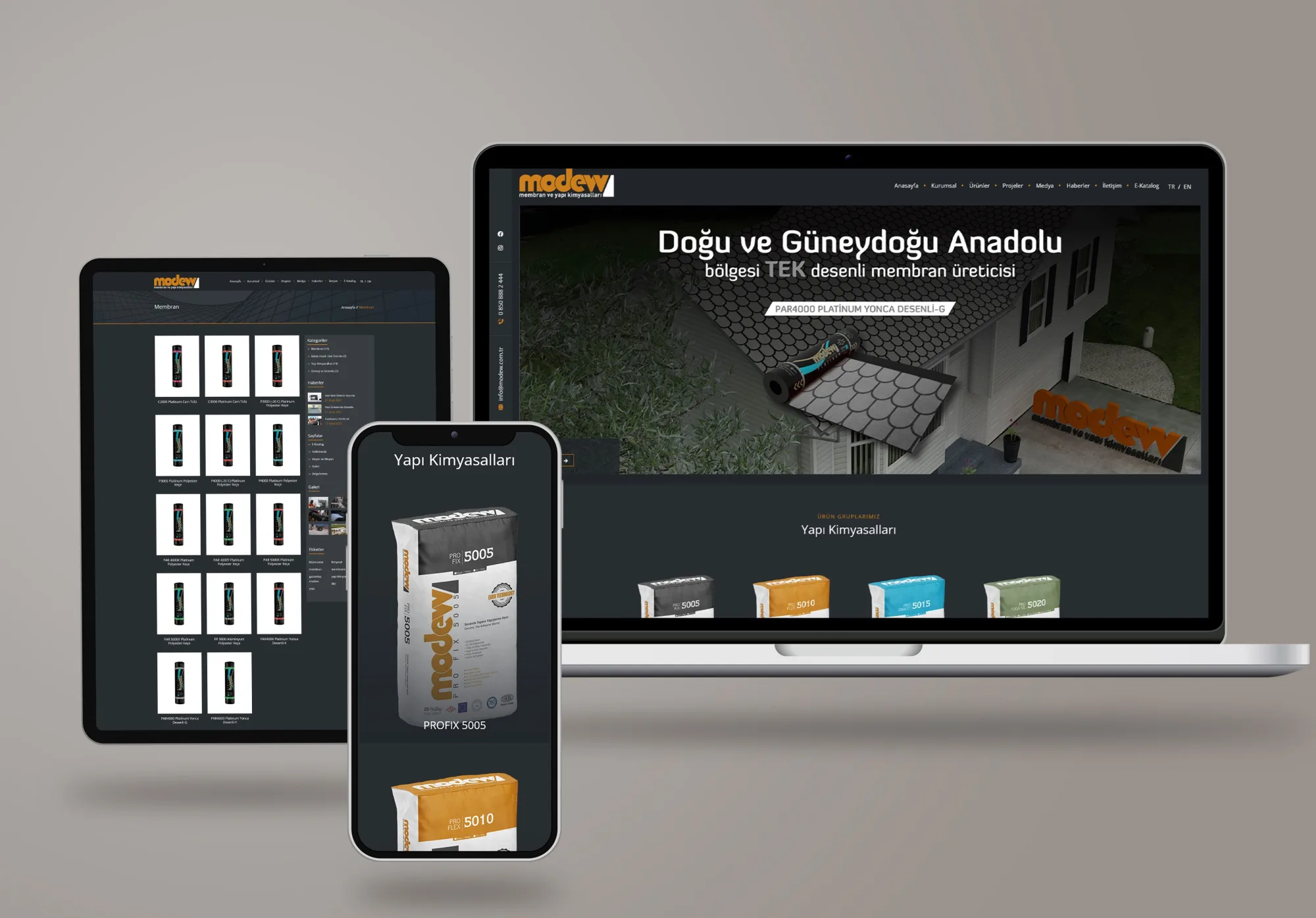
We built the communication on accurate information and a distinct identity.
We treated the brand identity as a design framework that guides how technical content is presented. Using colour codes, typographic hierarchy and content structure, we distinguished the solution areas from one another. We created a communication language that improves clarity across every channel and makes the brand easier to recognise.
Logo
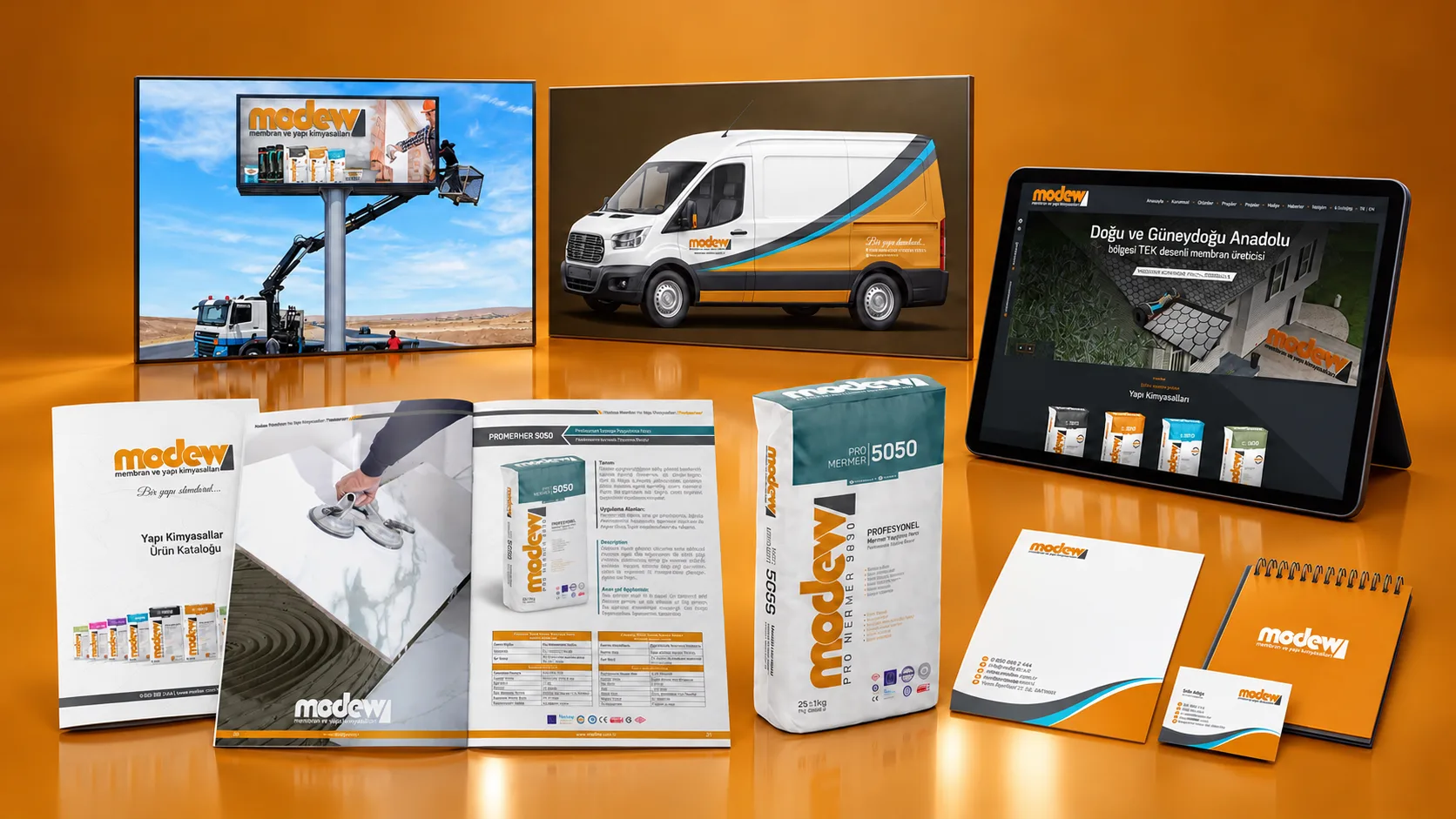
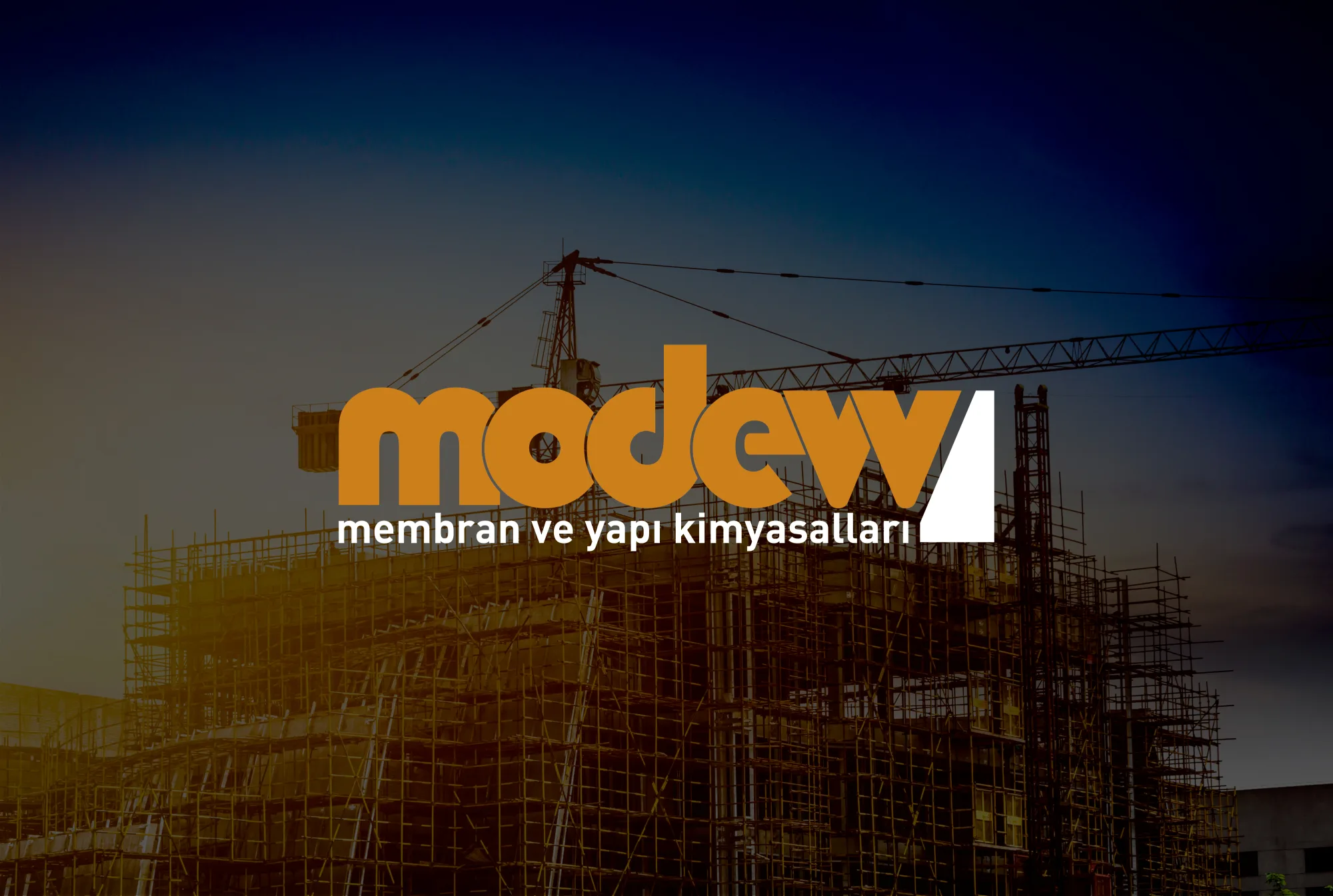
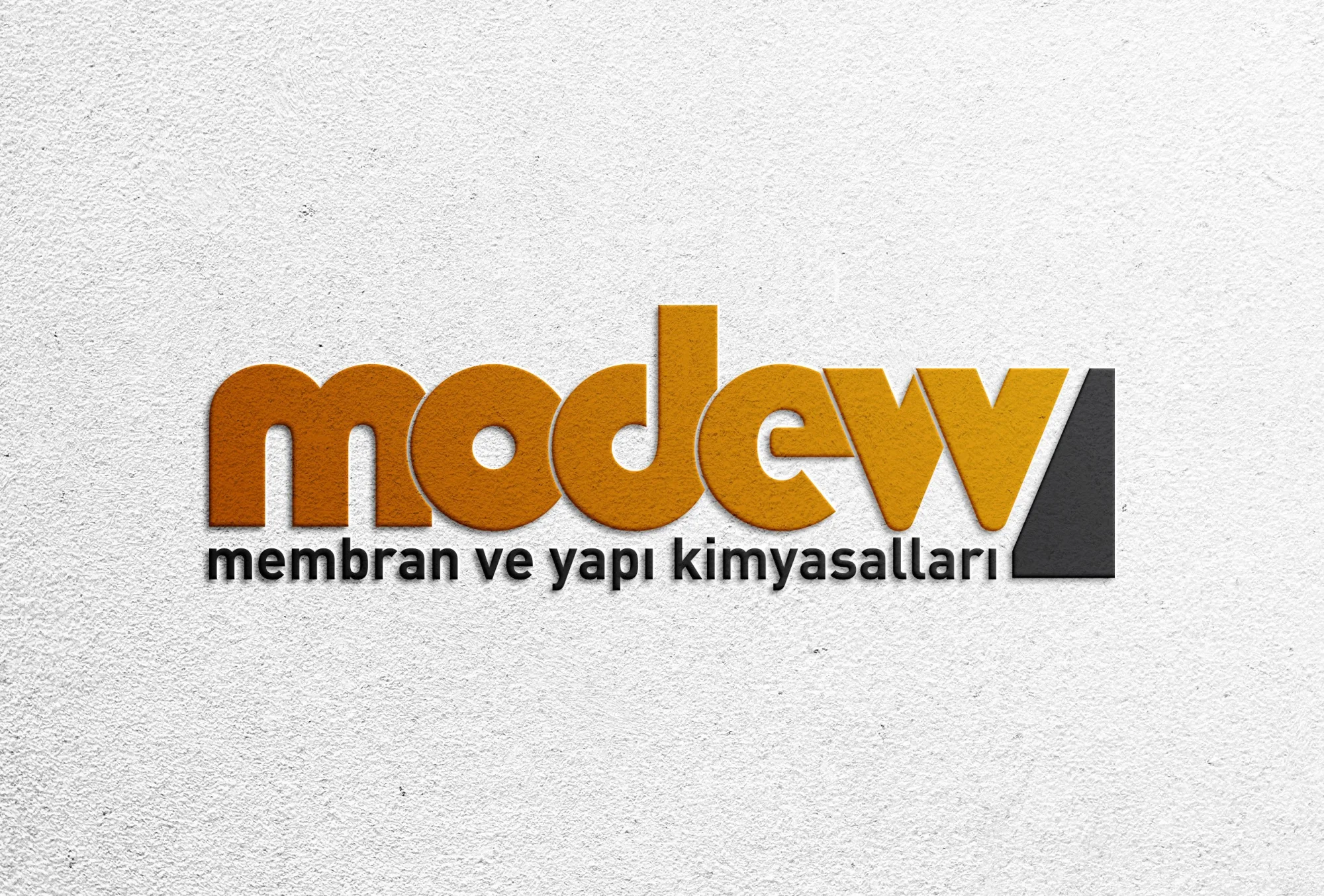
A logo that reflects the brand’s focus on strength and trust, standing apart through its distinct form and balanced typography.
Corporate identity
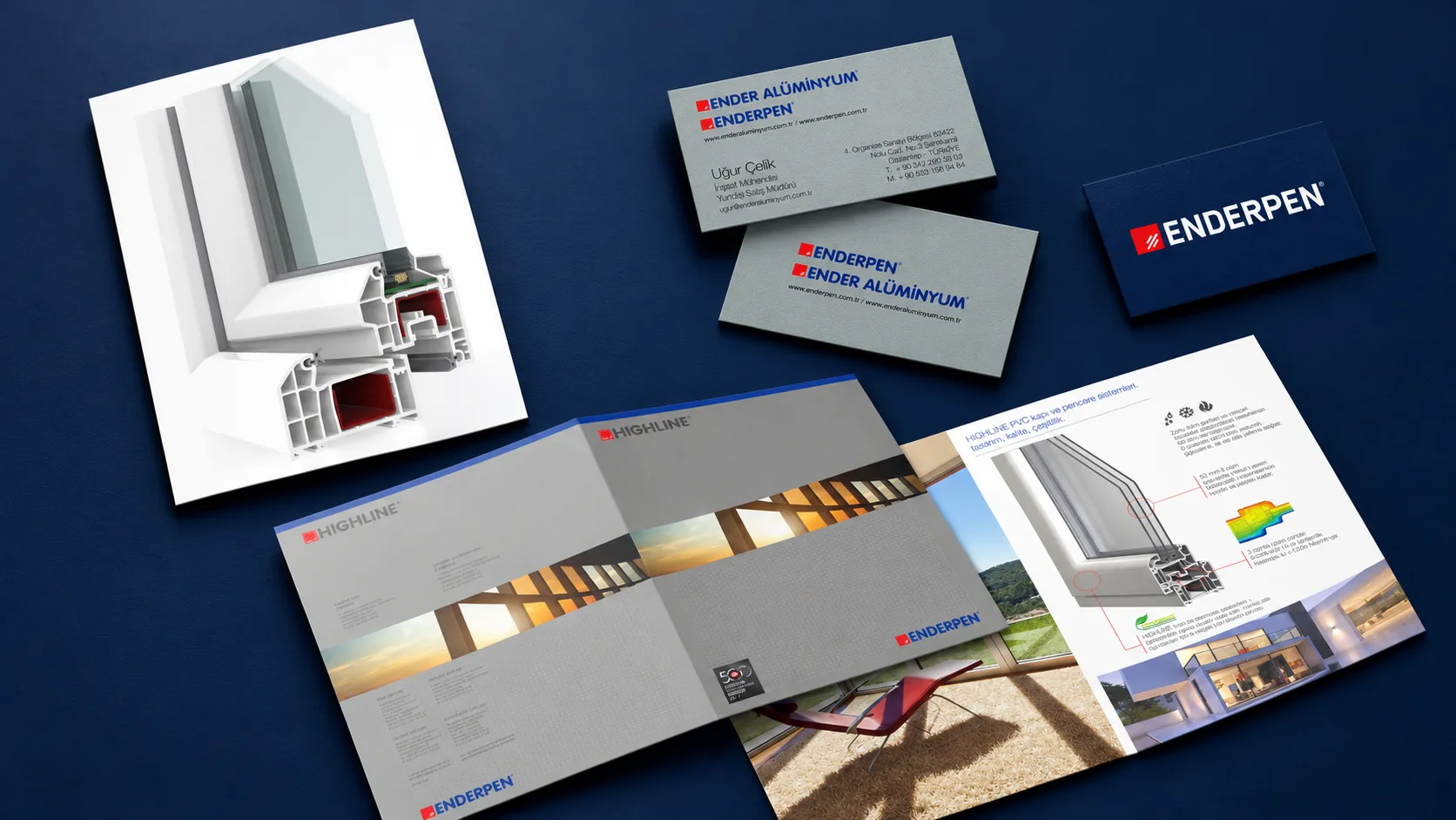
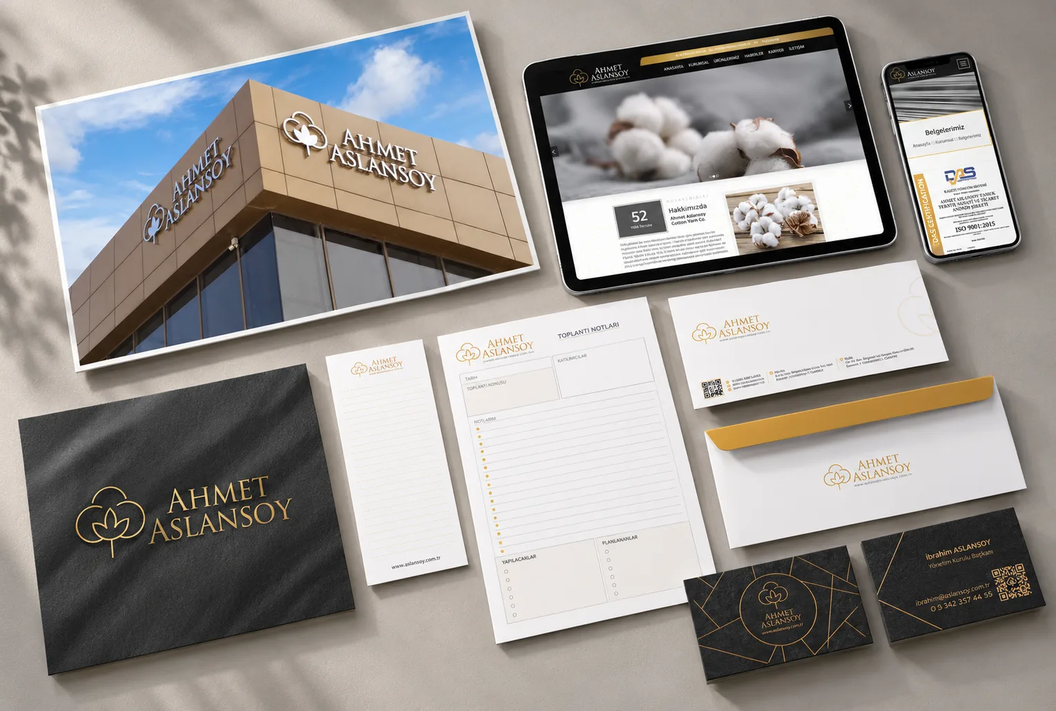
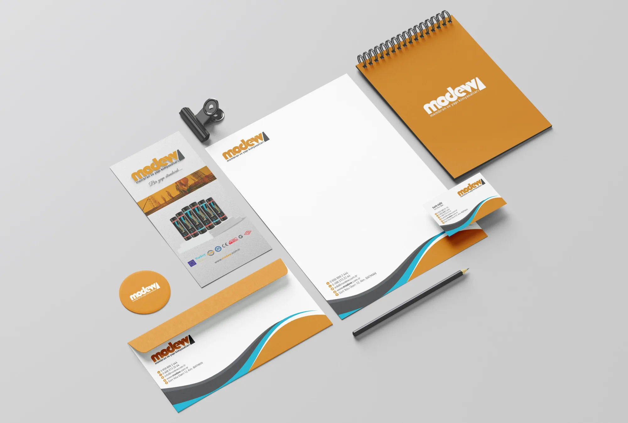
An identity system that defines the use of colour, typefaces and graphic elements, maintaining brand consistency across different applications.
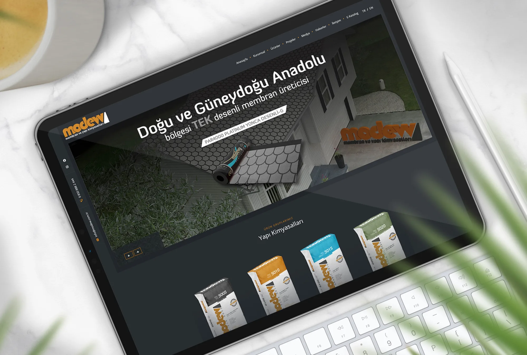
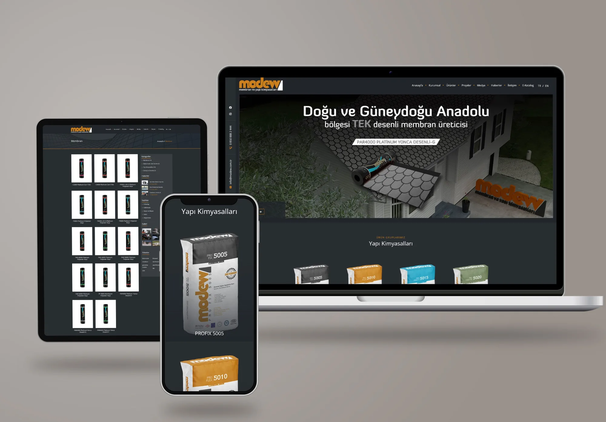
Website
A website that presents solution areas and product information in an orderly structure, making it easier for users to reach the content they need.
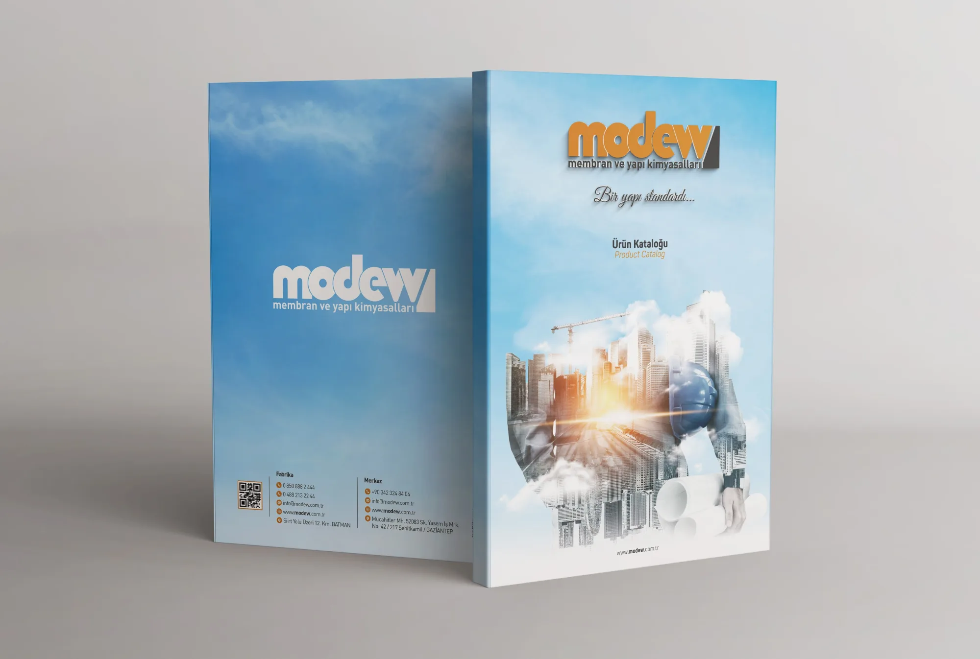
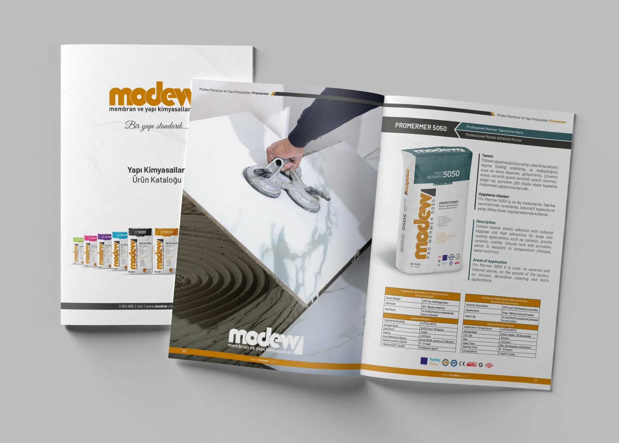
Catalogue
A catalogue design that brings together product groups, applications and technical information within a clear hierarchy.
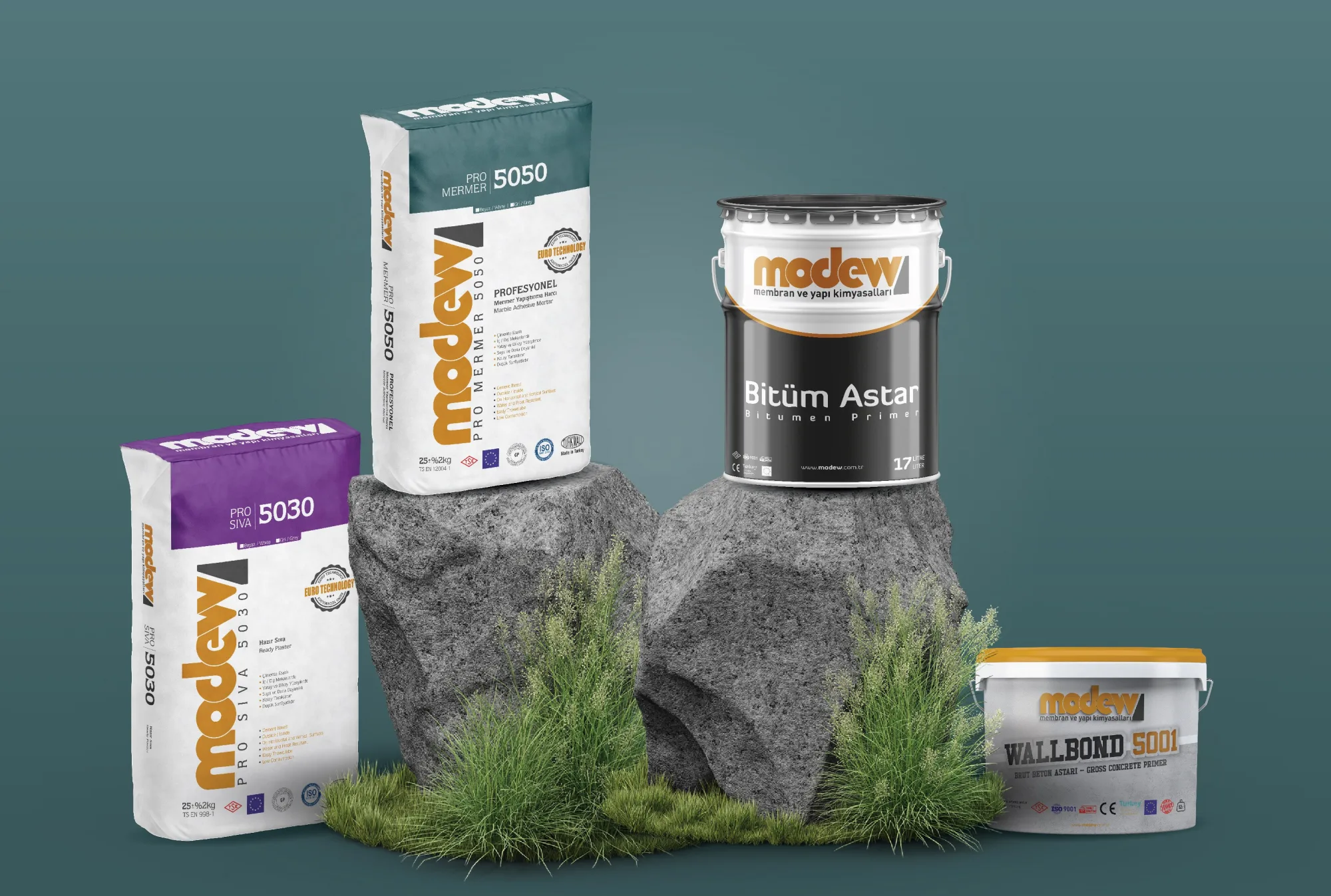
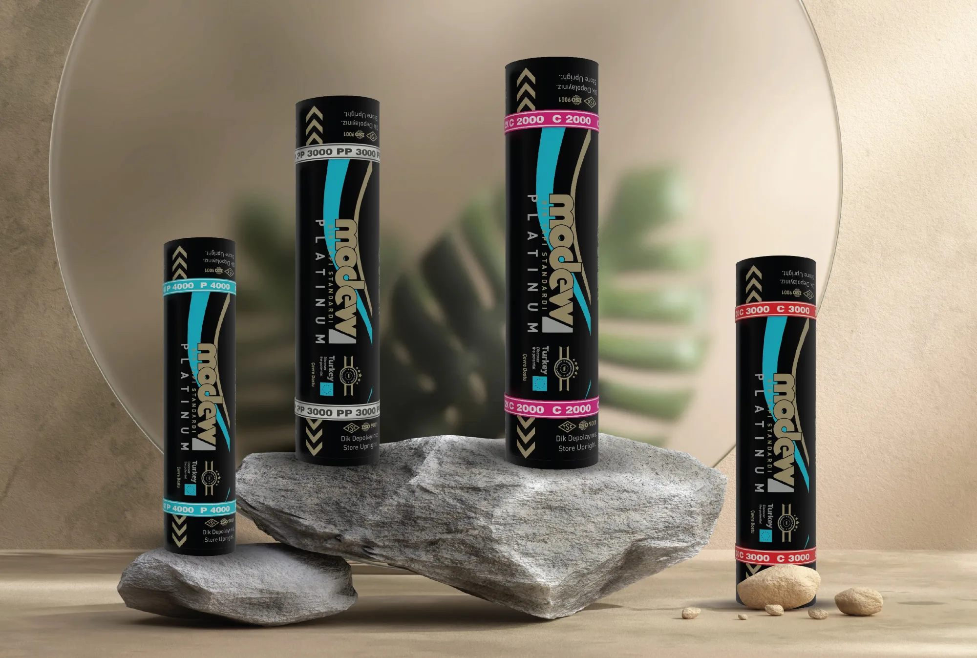
Packaging
Packaging designs that visually unify the product family, highlight usage information and make categories easy to tell apart.
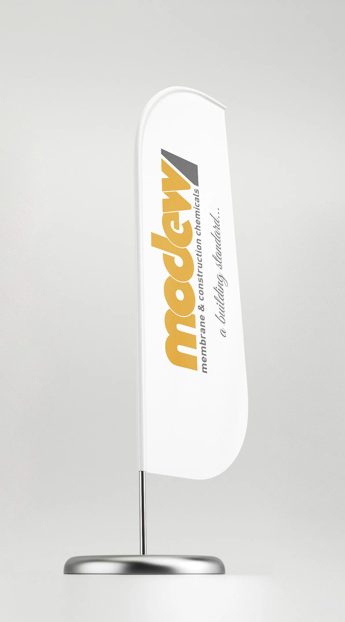
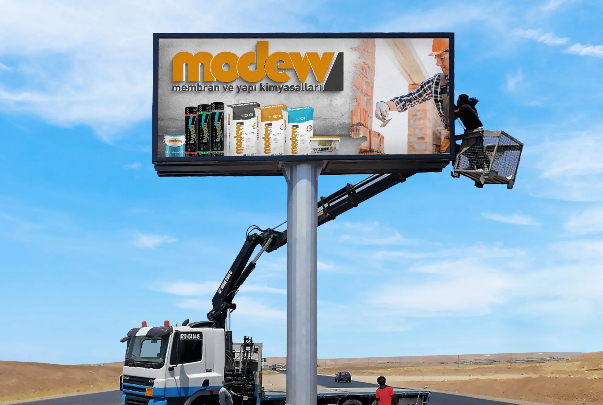
Outdoor
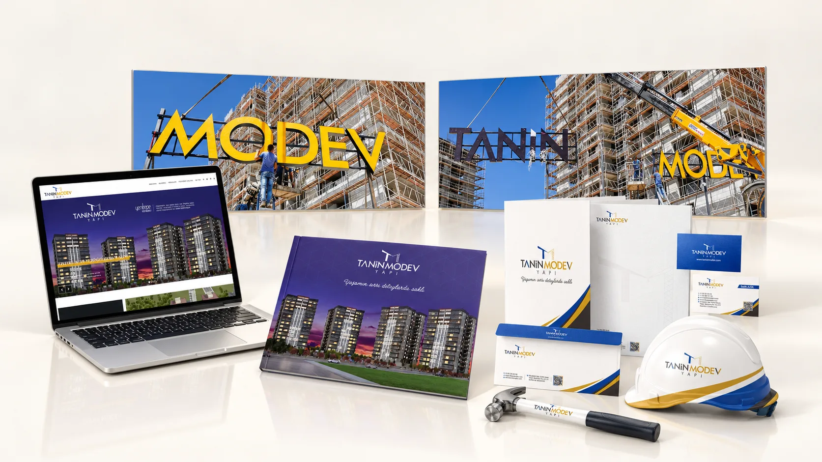
Outdoor designs built on concise messaging and a strong visual focus, making the brand’s standing in the industry visible.
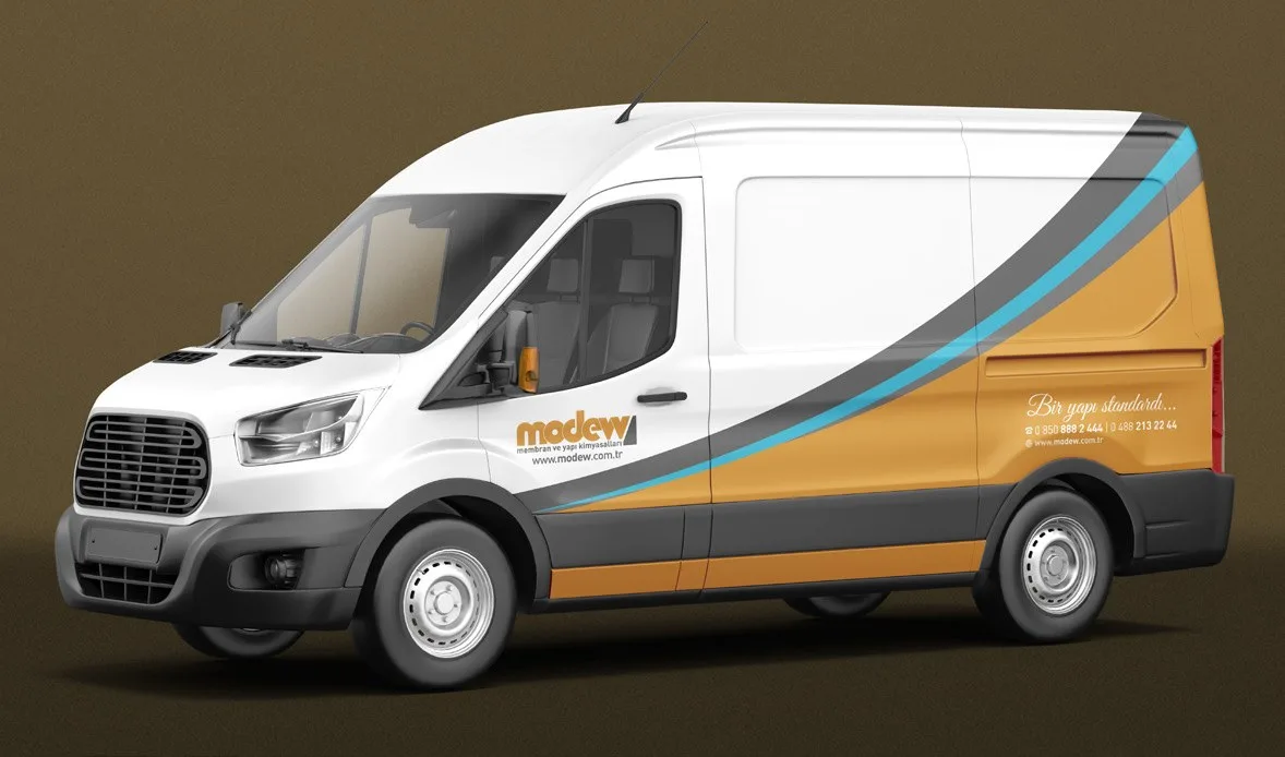
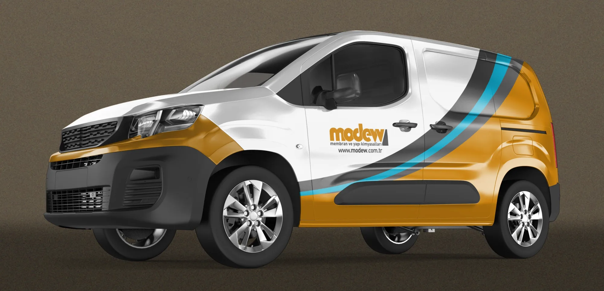
We adapted the system we designed to the needs of each channel.
We refined the order of information in the catalogues and packaging, and the navigation and content flow on the website. In the outdoor work, we sharpened the message and put visibility first. While developing each application within its own requirements, we preserved the identity system’s recognisability and visual continuity.

A trustworthy identity, clear brand communication.
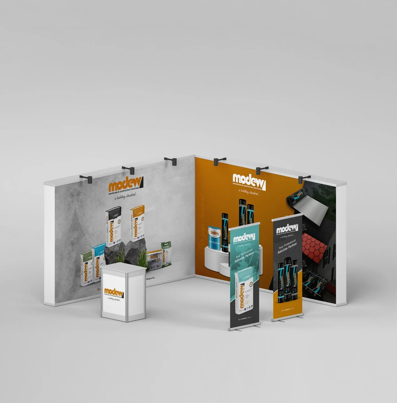
“It was a piece of work that presents our solution areas more clearly and accurately reflects our brand’s stance. The design consistency maintained across different applications brought the clarity and order we were looking for to our communication.”
Modew — Marketing Team